Chance News 107
September 13, 2015 to December 31, 2015
Quotations
"Mr. Slemrod [a public finance economist at the University of Michigan] also urged economists to talk in terms of ranges rather than point estimates when discussing how taxes affect the economy, to reflect the fact that these figures are simply educated guesses. But he understands why they don’t. 'Washington wants a number,' he said. “Washington doesn’t like confidence intervals.'"
Submitted by Bill Peterson
“If ten thousand people flip a coin, after ten flips the odds are there will be someone who has turned up heads every time. People will hail this man as a genius, with a natural ability to flip heads. Some idiots will actually give him money. This is exactly what happened to LTCM. But it’s obvious that LTCM didn’t know [bleep] about risk control. They were all charlatans.”
“[E]conomic decisions are usually best made on the basis of ‘expected value’ …. Clearly just one of the many things that can happen will happen – not the average of all of them. …. I always say I have no interest in being a skydiver who’s successful 95% of the time.”
“Loss occurs when risk – the possibility of loss – collides with negative events. Thus the riskiness of an investment becomes apparent only when it is tested in a negative environment. …. The fact that an investment is susceptible to a serious negative development that will occur only infrequently … can make it appear safer than it really is. …. That’s why Warren Buffett famously said, ‘… you only find out who’s swimming naked when the tide goes out.’”
“[A]fter the 2012 presidential election, Nate Silver, Princeton’s Sam Wang, and other poll aggregators were hailed for correctly predicting all fifty state outcomes, but almost no one noted that a crude, across-the-board prediction of ‘no change’ … would have scored forty-eight out of fifty, which suggests that the many excited exclamations of ‘He called all fifty states!’ we heard at the time were a tad overwrought.”
“If a forecaster says there is a 74% chance the Republicans will win control of the Senate in an upcoming election, [NYT economics journalist David] Leonhardt warned readers, do not conclude the forecast was wrong if the party doesn’t take the Senate because ‘a 74 percent chance it will’ also means ‘a 26 percent chance it won’t.’”
“It has been shown that people will place larger bets on a coin that has not yet been tossed than on a coin that has already been tossed …. And people will, if asked how much money they would demand to part with a lottery ticket they already hold, give a figure over four times greater if they themselves chose the lottery number on the ticket. Apparently, at some magical level people think that they can influence a coin that has not yet been tossed and influence the likelihood of winning the lottery by choosing the number.”
From an article discussing whether political polls are useful or harmful, relative to their effect on the population, especially due to the non-transparency of the polling methodologies and of the raw data:
“’Although you can take a nation’s pulse’ E. G. White wrote after the [1948] election, ‘you can’t be sure that the nation hasn’t just run up a flight of stairs.’”
“…. Gallup Poll’s former managing editor David Moore [stated] that ‘media polls give us distorted readings of the electoral climate, manufacture a false public consensus on policy issues, and in the process undermine American democracy.’ Polls don’t take the pulse of democracy; they raise it.”
Submitted by Margaret Cibes
"Fisher was a champion of P values as one of several tools to aid the fluid, inductive process of scientific reasoning—not to substitute for it. Fisher used 'significance' merely to indicate that an observation was worth following up, with refutation of the null hypothesis justified only if further experiments 'rarely failed' to achieve significance This is in stark contrast to the modern practice of making claims based on a single demonstration of statistical significance."
Submitted by Margaret Cibes at the suggestion of Jim Greenwood
Forsooth
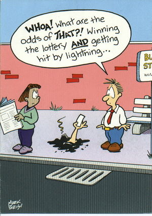
The last edition of Chance News included a story on Lightning and the lottery, which is reminiscent of the following greeting card:
Submitted by Alan Shuchat
"... I’ve listed the share of Democratic voters who identified as liberal, and as white, in the 39 states where the networks conducted exit polls during the 2008 Democratic primaries. Then I’ve multiplied the two numbers together to estimate the share of Democrats in each state who were both white and liberal. ...It would be better if the exit polls directly listed the number of white liberals. Unfortunately, the exit polls do not provide this data, so we have to live with an estimate instead."
FiveThirtyEight.com, 8 July 2015
Submitted by Peter Doyle
“Life is sweet. Vanilla cupcakes are sweet. Therefore, life is a vanilla cupcake!"
Submitted by Margaret Cibes at the suggestion of Jim Greenwood
A Forsooth video!
Mike Olinick sent a link to the following:
by Bret Weiner, New York Times, 29 December 2015.
The video there is a dramatization of the actual transcripts from a legal deposition, in which an "expert" testifying about a traffic accident is unwilling to explain how to compute distance from a scale diagram. After repeated questions it appears that, even with a calculator, he cannot find the decimal equivalent of 3/16!
The day after a big NYC political rally a TV commentator exclaimed that Sanders “had broken his previous record of 28,000 in Oregon.” The onscreen figure was 28,356.
“[Y]ou had only to study the history of the [MLB] draft to see that high school pitchers were twice less likely than college pitchers, and four times less likely than college position players, to make it to the big leagues.”
Submitted by Margaret Cibes
"Donnellan added that the USGS' 85% probability and her 99.9% chance still favored a big earthquake in the next three years. 'If an earthquake happens in three years, we're both right,' Donnellan said."
Submitted by Bill Peterson
Vitamin C and cancer
Vitamin C and cancer: Has Linus Pauling been vindicated?
ScienceBlogs, 18 February
The post links to a story from the Guardian which reports that doctors are studying whether large doses of Vitamin C together with drug treatments can improve cancer survival rates. This of course calls to mind Linus Pauling's longtime campaign to promote medical uses of Vitamin C. From ScienceBlogs we read:
It’s been noted that there appears to be a tendency among Nobel Prize recipients in science to become enamored of strange ideas or even outright pseudoscience in their later years. Indeed, it’s happened often enough that some wags have dubbed this tendency the “Nobel disease.” Be it Linus Pauling and his obsession with vitamin C, Nikolaas Tinbergen and his adoption of the “refrigerator mother” hypothesis as the cause of autism (which has led one blogger going by the ‘nym Prometheus to quip that Tinbergen’s Nobel acceptance speech represented a “nearly unbeatable record for shortest time between receiving the Nobel Prize and saying something really stupid about a field in which the recipient had little experience”)
[T]here’s something about becoming a Nobel Laureate that has a tendency to lead people to becoming cranks. Either that, or maybe it’s because mavericks who make Nobel-worthy discoveries have a tendency not always to recognize that not all of their ideas are as brilliant as the ones that garnered the Nobel Prize for them, although certainly another possibility is that winning the Nobel Prize tends to give some scientists an inflated sense of their own expertise in fields of science not related to the ones for which they won their Nobel Prize in the first place. Maybe it’s a bit of all of these.
Submitted by Paul Alper
Bad graphic on Planned Parenthood
John Emerson sent a link to the following:
Congressman uses misleading graph to smear Planned Parenthood
by Zachary Roth, MSNBC.com, 29 September 2015
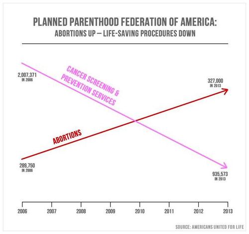
At a Congressional hearing on Planned Parenthood, Rep. Jason Chaffetz (R-Utah) used the following double-y-axis plot to criticize Planned Parenthood:

Albert Kim noted that this is "a mild variant of the Fundamental Law of Media Graphs." From the article, we read:
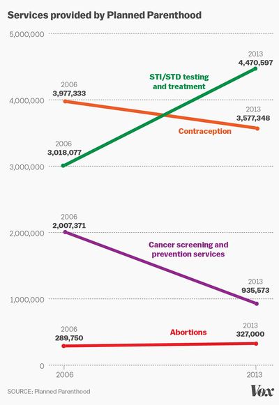
What the slide actually shows, of course, is that the number of abortions performed by Planned Parenthood rose very modestly between 2006 and 2013, while the number of anti-cancer services it performed did indeed fall by more than half. But [Planned Parenthood president Cecile] Richards said some of the services, like pap smears, dropped in frequency because of changing medical standards about who should be screened and how often. Displaying that information on an actual graph would show the line for abortions rising very slightly over the 7-year time period, and the line for anti-cancer services dropping, but always remaining far above the line for abortions.
Indeed, in 2012 the American Cancer Society announced its New Screening Guidelines for Cervical Cancer. While the ACS used to recommend an annual Pap smear, the new guidelines state:
- Women between the ages of 21 and 29 should have a Pap test every 3 years. They should not be tested for HPV unless it is needed after an abnormal Pap test result.
- Women between the ages of 30 and 65 should have both a Pap test and an HPV test every 5 years. This is the preferred approach, but it is also OK to have a Pap test alone every 3 years.
Double-y-axis plots always have the potential to mislead, as the axis scales can be adjusted to exaggerate the correspondence in the line plots (see the Spurious Correlations web site, which has been mentioned in several earlier issues of Chance News). The example above is especially bad in that in presents only two time points. Also, both variables actually have the same units (number of procedures), but the trick of using two axis scales creates the impression of a crossover point that has nothing to do with the data. See Whatever you think of Planned Parenthood, this is a terrible and dishonest chart (Vox, 29 September 2015) for a useful redrawing of this graph that places the data in context:

Finally, for comic relief, see this video clip of John Oliver's response to the controversy (the segment to watch is from 1:09 to 2:21. Thanks to Miranda de Beer for this link.
Hot hand, again!
Paul Alper wrote sent a reference to a new post Andrew Gelman's blog: Hot hand explanation again (30 September 2015), which was wriiten to recent news coverage of the hot hand debate:
- The ‘hot hand’ debate gets flipped on its head
- by Ben Cohen, Wall Street Journal, 30 September 2015
The WSJ gives this description of the key insight in the recent paper of Miller and Sanjurjo (see Does selection bias explain the "hot hand"? in Chance News 105) :
Their [Miller and Sanjurjo's] breakthrough is the surprising math of coin flips. Take the 14 equally likely sequences of heads and tails with at least one heads in the first three flips—HHHH, HTHH, HTTH, etc. Look at a sequence at random. Select any flip immediately after a heads, and you’ll see the bias: There is a 60% chance it will be tails in the average sequence.
The counterintuitive result comes comes by averaging over sequences rather than over opportunities for a head to follow a head (see this discussion in Chance News 106 for a detailed comparison of the two averages). Here is Gelman's explanation:
If you weight by the number of opportunities you indeed get the correct answer of 50% here, but the point is that when the hot hand has traditionally been estimated, the estimation has been done by taking the empirical difference for each player, and then taking a simple (not weighted) average across players, hence the bias, as explained and explored in several recent papers by Josh Miller and Adam Sanjurjo.
The famous research in the 1980s by Gilovich, Tversky and Vallone had argued that a shooter's rate of success did not change after a streak of successes, despite the impressions of players and fans. But if that success rate was estimated in the biased manner described above, then it should actually have appeared lower after a streak. The fact that it did not suggests some sort of hot hand effect may have been operating. The WSJ quotes statistician Hal Stern: "Almost anyone I’ve interacted with about this [Miller-Sanjurjo] paper has said it’s pretty compelling but the effect is likely small.” Other researchers say that they are now motivated to reexamine the original data.
It seems, then, that the debate is not going away anytime soon. Indeed, here is another recent mention in the news:
- Gamblers, scientists and the mysterious hot hand, by George Johnson, New York Times, 17 October 2015
The article quotes a reaction from Tom Gilovich:
Dr. Gilovich is withholding judgment. “The larger the sample of data for a given player, the less of an issue this is,” he wrote in an email. “Because our samples were fairly large, I don’t believe this changes the original conclusions about the hot hand. ”
For a nice exposition of the pitfalls of averaging, see;
- "Hot hands" in basketball are real, by Jordan Ellenberg, Slate, 26 October, 2015
Ellenberg first asks us to think about all families with children in a particular town, and then to guess the average ratio of boys to girls in those families. Naive intuition suggests that the average ratio is close to 1:1. However, as Ellenberg explains, if even one family has all boys, then its ratio of boys to girls is infinity, which in turn makes the average over all families infinite. His point is that "the ratio of the averages is not necessarily the average of the ratios." The article includes several other examples to explain why the averaging scheme in the original hot hand analyses would be considered suspect.
Diagnosing disease by smell
Miles Ott sent this link to the Isolated Statsticians list, with the description "A new 'lady tasting tea' example."
- The amazing woman who can smell Parkinson’s disease — before symptoms appear
- by Yanan Wang, Washington Post, 23 October 2015
This is the story of a Scottish woman named Joy Milne. Prior to her husband's diagnosis with Parkinson's disease, Milne's acute sense of smell led her to believe that something had changed with him. Was this just a coincidence, or a clue to early detection of Parkinson's?
An small experiment was conducted to find out (which, as Miles noted, is strongly reminiscent of Ronald Fisher's famous lady tasting tea example). Milne was presented with 12 T-shirts, 6 of which had been worn by known Parkinson's patients and 6 by controls. Milne reported that 7 of the shirts had the unusual smell. Six of these were from the Parkinson's patients, and one was a control. But it turned out that, months later, this last individual was diagnosed with Parkinson's!
Colors, emotions, and a retraction
Paul Alper sent a link to the following:
- Got the blues? You can still see blue: Popular paper on sadness, color perception retracted
- by Alison McCook, Retraction Watch blog, 5 November 2015
A psychology study published earlier this year, reporting a link between emotional state and color perception, has now been retracted. In particular, sadness was found to influence the perception of blues and yellows, but not reds and greens. The story had received coverage in popular media. For example see this story from NPR; it originally aired on September 5, 2015, but was updated on November 5 to reflect the retraction. NPR quotes the study's authors:
We remain confident in the proposition that sadness impairs color perception, but would like to acquire clearer evidence before making this conclusion in a journal the caliber of Psychological Science.
To explain the error, Retraction Watch quotes the following description from MindHacks:
The flaw, anonymous comments suggest, is that a difference between the two types of colour perception is claimed, but this isn’t actually tested by the paper – instead it shows that mood significantly affects blue-yellow perception, but does not significantly affect red-green perception. If there is enough evidence that one effect is significant, but not enough evidence for the second being significant, that doesn’t mean that the two effects are different from each other. [emphasis added] Analogously, if you can prove that one suspect was present at a crime scene, but can’t prove the other was, that doesn’t mean that you have proved that the two suspects were in different places.
It turns out that this type of error is often committed. In a separate message, Paul sent a link to a 2011 article from Nature Neuroscience, entitled Erroneous analyses of interactions in neuroscience: a problem of significance. From the abstract
In theory, a comparison of two experimental effects requires a statistical test on their difference. In practice, this comparison is often based on an incorrect procedure involving two separate tests in which researchers conclude that effects differ when one effect is significant (P < 0.05) but the other is not (P > 0.05). We reviewed 513 behavioral, systems and cognitive neuroscience articles in five top-ranking journals (Science, Nature, Nature Neuroscience, Neuron and The Journal of Neuroscience) and found that 78 used the correct procedure and 79 used the incorrect procedure.
Ben Goldacre has addressed this issue in his "Bad Science" column for the Guardian; see The statistical error that just keeps on coming (9 Sept 2011).
Red meat and cancer
Albert Kim sent a link to this story:
- Beefing With the World Health Organization's Cancer Warnings
- by Ed Yong, The Altantic, 26 October 2015
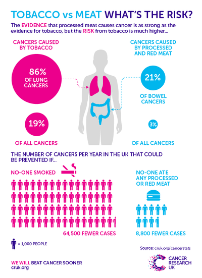
This fall, the International Agency for Research on Cancer (IARC) issued a report on the status of red and processed meats as carcinogens. Their finding of “sufficient evidence” that processed meat causes colorectal cancer was widely covered in the news media. The more sober reports stressed that the relative risk was still rather small. For example, this this New York Times article stressed in its lead paragraph that the risk was small, and later spelled out that "a person’s risk of colorectal cancer rises by a factor of about 1.1 or 1.2 for every serving of processed meat consumed per day." On the other hand, some of the more sensational headlines highlighted that the IARC had put processed meat in the same category ("carcinogenic to humans") as cigarettes. The IARC also found “limited evidence” limited evidence linking red meat to cancer. Not surprisingly, these reports drew strong rebuttals from meat industry groups.
The Atlantic article doesn’t contest the findings, but criticizes the Agency for creating the impression that red meat is as bad for you as tobacco. The NYT explained that smokers are 20 times as likely to develop lung cancer as nonsmokers. The Atlantic links to a very informative report from Cancer UK, which lays out the story more clearly. Reproduced below is one of their infographics, which more carefully compares the risks of tobacco and meat.

The situation was summed up succintly in the following tweet (also sent to us by Albert Kim):

Followup
See How risky is my diet from the NRICH program at University of Cambridge. Includes a video in which Professor David Spiegelhalter responds to a headline about bacon sandwiches.
