Chance News 94
Quotations
"...classic PPT statistical graphic: 13 logos, 10 numbers, 9 bubbles, 1 giant green arrow."
[quoted in: The real NSA scandal? The horrible slides. Washington Post, Wonkblog, 7 June 2013.]
Submitted by Bill Peterson
“6. (Mar's Law) Everything is linear if plotted log-log with a fat magic marker.”
Submitted by Margaret Cibes
According to Derek de Solla Price, "...in order to relieve the tedium of sitting for a portrait painter, on two different occasions he [Francis Galton] computed the number of brush strokes and found about 20,000 to the portrait; just the same number, he calculated, as the hand movements that went into the knitting of a pair of socks."
Submitted by Paul Alper
"Statistics is the science that lets you do twenty experiments a year and publish one false result in Nature."
Submitted by Paul Alper
“[By converting semester letter grades to numbers] we tempt ourselves to do arithmetic with them, something we couldn’t do with the equivalent letter grades. .... We then go on to compute an average – the infamous GPA ... based on the zero to four scale. We are then pretending that the numbers have real quantitative meaning. They don’t – they are simply inventions – yet the GPA has a major influence on students’ lives. In all the years this author has been teaching, he has never once heard anyone – student or professor – question the internal logic of translating subjective judgments into a numerical scale that is then averaged.” [p. 28]
Before retiring, as I remember it, faculty compared GPAs to four decimal places for the purpose of selecting top students for awards.
Submitted by Margaret Cibes
Forsooth
“The afternoon wave of [U.S. Open] starters began their first round Thursday in hot, sticky conditions and finished in cool, breezy weather on Friday. Luke Donald described the difference as ‘180 degrees’ ….”
by Karen Crouse, The New York Times, June 14, 2013
Submitted by Margaret Cibes at the suggestion of Jim Greenwood
"Doctors were on board and volunteered to help in 48 percent of cases; nurses and other health workers were available in another 28 percent. Only one-third of cases had to be handled by flight attendants alone."
Submitted by Bill Peterson
"So for a company that thought there was a 60 percent chance that it would have to pay $1,000 on a claim, and a 40 percent chance it would have to pay $2,000, its required reserve would rise from $1,000, the most probable number, to $1,400 — the average of the probabilities."
Submitted by Bill Peterson
"There are five different academic colleges/divisions: Arts and Science, Business, Education, Health and Society, Engineering and Applied Science, and Fine Arts (Miami University 2010)."
.
(But six are listed!)
Submitted by Jean-Hugues Roy
Statistics Without Borders
Statistics Without Borders
(not to be confused with “Statisticians WithOut Borders), a consulting group)
Current or future statisticians may be interested in the all-volunteer organization Statistics Without Borders. SWB is an Outreach Group of the ASA consisting of over 400 volunteer statisticians who provide free statistical consulting to organizations and government agencies, particularly from developing nations. Its goal is to “promote the use of statistics to improve the health and well-being of all people.”
The April 2013 issue of Significance magazine contains an article, “Haiti after the earthquake,”[1] that describes one of their 2010 projects.
Submitted by Margaret Cibes
Data about cell and landline phone usage
“Researchers Warn of ‘Bias’ in Landline-Only Phone Polls”
by Steven Shepard, National Journal, June 18, 2013
The CDC reports that landline phone surveys in 2012 were most likely to reach older, whiter Americans. The article gives a number of statistics about landline vs. cell phone usage among various demographic groups.
(The article also states that it is illegal for automatic dialers to call cell phones, which makes polling cell phone holders more expensive. I’m not sure how many companies observe this ban!)
One interesting fact, if true:
Calling the proper number of cell phones is not a guarantee of accuracy: Gallup, which called the most cell phones, was considered among the least accurate survey firms in its 2012 pre-election polls; PPP, which called none, was considered among the most accurate.
Submitted by Margaret Cibes
Google's hiring methodology
Paul Alper sent a link to the following:
On GPAs and brainteasers: New insights from Google on recruiting and hiring, by Adam Bryant, LinkedIn.com
Paul flagged the following two passages as Forsooths:
The ability to hire well is random. “Years ago, we did a study to determine whether anyone at Google is particularly good at hiring,” Bock [Google’s senior vice president for people operations] said. “We looked at tens of thousands of interviews, and everyone who had done the interviews and what they scored the candidate, and how that person ultimately performed in their job. We found zero relationship. It’s a complete random mess, except for one guy who was highly predictive because he only interviewed people for a very specialized area, where he happened to be the world’s leading expert.”
GPAs don’t predict anything about who is going to be a successful employee. “One of the things we’ve seen from all our data crunching is that G.P.A.’s are worthless as a criteria for hiring, and test scores are worthless — no correlation at all except for brand-new college grads, where there’s a slight correlation,” Bock said. “Google famously used to ask everyone for a transcript and G.P.A.’s and test scores, but we don’t anymore, unless you’re just a few years out of school. We found that they don’t predict anything."
Dialect maps
These dialect maps showing the variety of American English have set the internet on fire
by Alexis Kleinman , Huffington Post, 6 June 2013
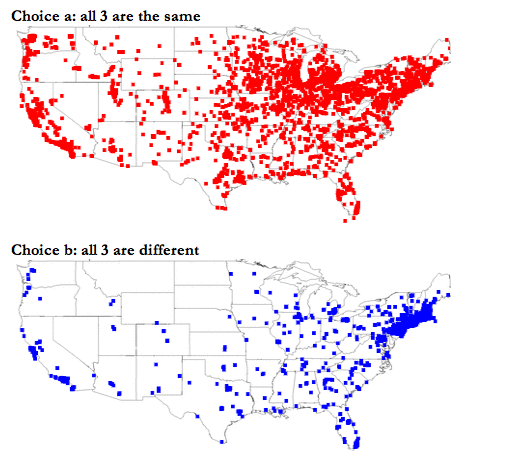
A series of data maps depicting word usage and pronunciation differences across America has gone viral on the internet. The maps were produced by North Carolina State University graduate student Joshua Katz, based on survey research initiated by Cambridge University linguist Bert Vaux and his colleagues.
A great deal of information about the project and the mathematics involved can be found at Katz's poster for his project. The poster is entitled Beyond "Soda, Pop, or Coke". People with roots in the Boston area may be surprised that "Tonic" didn't make the list! The study also has the perennial favorite of us Easterners who have married someone from elsewhere:
How do you pronounce Mary/merry/marry?
In all, there are 122 sets of maps relating to regional differences in pronunciation and usage. Links are available here (the above maps are reproduced from Item 15).
Submitted by Paul Alper
Are you scientifically literate?
Now you can find out. Physicist and author James Trefil of George Mason University devised a short quiz, which was published in the Toronto Star. There are 26 multiple-choice questions on biology, physics, and chemistry. Score 80% and you make the grade, according to Professor Trefil.
(I admit to apprehension about taking the test. But I can state, happily, my score met the standard for literacy – a reassuring result for a career scientist.)
Of course, multiple choice exams have their drawbacks. With four choices per question and no penalty for an incorrect answer, a know-nothing could expect a mark of 25% – still mired in ‘F’, but better than a goose egg.
For the indecisive and the unlearned, however, there are more strategic methods than sheer guessing in multiple choice tests. One ploy, when in doubt, is to choose answer (c). Examiners seem to find this letter a favourite, presumably to conceal the correct answer amongst the wrong ones. Another trick is to pick the longest answer, given that teachers tend to add details to make the correct answer entirely true.
Adhering to the “choose (c)” rule, I scored 42% on the quiz – significantly better than random (binomial test, P = 0.040, 1-tailed). Choosing the longest answer gave an even more impressive grade of 58% – clearly superior to random picks (P = 0.00039), but still short of true literacy. Alas, it appears there is no substitute to learning science to become scientifically literate.
Submitted by James Schaefer
Twitter settles the argument about geeks versus nerds
On "Geek" Versus "Nerd" Burr Settles, June 2, 2013.
What's the difference between a geek and a nerd?
To many people, “geek” and “nerd” are synonyms, but in fact they are a little different. Consider the phrase “sports geek” — an occasional substitute for “jock” and perhaps the arch-rival of a “nerd” in high-school folklore. If “geek” and “nerd” are synonyms, then “sports geek” might be an oxymoron. (Furthermore, “sports nerd” either doesn’t compute or means something else.)
Dr. Settles reviews some perspectives on this, but then decides to examine this empirically.
To characterize the similarities and differences between “geek” and “nerd,” maybe we can find the other words that tend to keep them company, and see if these linguistic companions support my point of view?
Twitter provides one empirical answer.
I analyzed two sources of Twitter data, since it’s readily available and pretty geeky/nerdy to boot. This includes a background corpus of 2.6 million tweets via the streaming API from between December 6, 2012, and January 3, 2013. I also sampled tweets via the search API matching the query terms “geek” and “nerd” during the same time period (38.8k and 30.6k total, respectively).
The statistic used is pointwise mutual information. You can find a formula for this in the original article. It is effectively the difference in the logarithms between the conditional probability and the unconditional probability.
The PMI statistic measures a kind of correlation: a positive PMI score for two words means they ”keep great company,” a negative score means they tend to keep their distance, and a score close to zero means they bump into each other more or less at random.
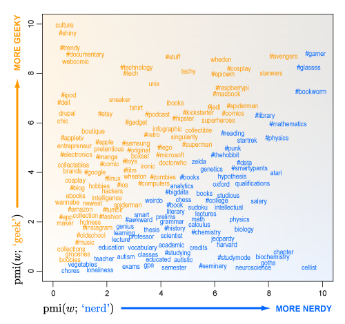
You can graph the PMI for a particular word given "nerd" on one axis of a graph and the PMI for a particular word given "Geek" on the other axis. That produces the following picture, which has been reproduced many times on the Internet.

Words in the lower right corner of the graph (coded in blue) are those that are more strongly associated with "nerd" than "geek". Word in the upper left corner (coded in orange) are more strongly associated with "geek" than "nerd".
Dr.Settles draws the following conclusion:
In broad strokes, it seems to me that geeky words are more about stuff (e.g., “#stuff”), while nerdy words are more about ideas (e.g., “hypothesis”). Geeks are fans, and fans collect stuff; nerds are practitioners, and practitioners play with ideas. Of course, geeks can collect ideas and nerds play with stuff, too. Plus, they aren’t two distinct personalities as much as different aspects of personality.
Questions
1. What other statistic might be used instead of PMI to describe the association between various words and "geek/nerd".
2. The article mentions the Googe ngrams corpus as an alternative source of information. What are the advantages and disadvantages of this source compared to Twitter? Are there other sources of data that could help resolve the geek/nerd distinction?
3. Is mining data from Twitter an activity more associated with a "geek" or with a "nerd".
Submitted by Steve Simon
Do clinical trials work?
Do clinical trials work?
by Clifton Leaf, New York Times, 13 July 2013
That headline is the question raised by this op/ed piece. More specifically, the author asks, "are the diseases of individuals so particular that testing experimental medicines in broad groups is doomed to create more frustration than knowledge?"
The author discusses trial of the drug Avastin in patients newly diagnosed with a certain brain cancer called glioblastoma multiforme. A team led by Dr. Mark Gilbert at University of Texas Cancer Center did a randomized controlled study with 600 patients, and found no statistically significant benefit from the drug. Nevertheless, we read in the article that, after the trial,
...doctors had no more clarity after the trial about how to treat brain cancer patients than they had before. Some patients did do better on the drug, and indeed, doctors and patients insist that some who take Avastin significantly beat the average. But the trial was unable to discover these “responders” along the way, much less examine what might have accounted for the difference. (Dr. Gilbert is working to figure that out now.)
Discussion
What do you think is meant by the phrase "some who take Avastin significantly beat the average"?
Submitted by Bill Peterson
Followup
Not surprisingly, this piece drew quick responses from experts on clinical trials; several letters to the editor were presented under the title In defense of clinical drug trials (NYT, 18 July 2013). In a joint letter, members of the editorial boards of the journals Clinical Trials and the Annals of Internal Medicine point out that the Avastin trial was presumably negative because subjects in the control group had "responses" similar to those in the treatment group! In another letter, the president of the American Society of Clinical Oncology reminds us that "clinical trials have been the foundation of progress against cancer for more than 50 years."
A poor graph from Dyson
I took this screenshot from the official Dyson website, after having encountered the ad on the back cover of Time magazine (22 July 2013). It obviously this violates one of Edward Tufte's famous principles of graphical integrity: "The number of variable dimensions depicted should not exceed the number of dimensions in the data."

Of course, displays like this are nothing new (think USA Today data snapshots), and exaggeration goes on all the time in advertising. The real disappointment is to see such a poor data presentation from a company that promotes an image of engineering excellence!
Submitted by Bill Peterson
It's a boy!
Paul Alper sent a link to the following:
The royal male? It's the best bet for delivery
by Carl Bialik, Numbers Guy blog, Wall Street Journal, 20 July 2013
Bialik discusses the odds the betting odds on the unknown gender of the about-to-be-born heir to Britain. Bettors were favoring a girl, which was paying out £4 on a £7 bet. He quotes a spokesperson for the betting site StanJames.com as saying "We suspect that is because somebody knows something we don't." Of course, we now that the baby has arrived, we know it was a boy!
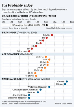
It is well-known that gender is not quite a fair coin toss; there is a slight bias towards male births. Bialik presents the following graphic (full-size version from WSJ here) showing data from the US.

Discussion
Paul observes that the linear trend in the first graph looks suspiciously noise-free. What do you make of this?
Forecasting fluctuations
Why Flip a Coin?
by former physics prof H. W. Lewis, Wiley, 1997
An excerpt from this book contains the following passage (p. 132) about a “magic rule” relating to a standard error:
It is this kind of unpredictability of the outcome of a test [tossing a die] governed by the laws of probability that we will call fluctuations. If we have nothing better to do than to keep repeating the test the outcome will indeed “fluctuate wildly,” in the … Random House sense. Here there is a magic rule that tells you that for such a case, whatever the expected number of events (based on their probability) may be, the average fluctuation is just about the square root of that number. (That magic number is called the standard deviation. The rule does not apply in all cases, but in most.) So if we expect something to occur a hundred times, we shouldn’t be surprised if it happens ten times more or less, perhaps ninety times; if we expect sixteen, twenty would be unsurprising. But remember that these statements about fluctuations are themselves probabilistic ….
Submitted by Margaret Cibes
