Chance News (September-October 2005)
Do car seats really work?
Freakonomics: the seat-belt solution
New York Times, 10 July 2005,
Steven J. Dubner and Steven D. Levitt
Dubner and Levitt are the authors of Freakonomics: A Rogue Economist Explains the Hidden Side of Everything (HarperCollins, 2005), which raises a host of provocative questions, including "Why do drug dealers still live with their mothers?" and "What do schoolteachers and sumo wrestlers have in common?"
In the present article, Dubner and Levitt challenge the conventional wisdom on car seats. Their take-no-prisoners style is evident in the following quote: "They [car seats] certainly have the hallmarks of an effective piece of safety equipment: big and bulky, federally regulated, hard to install and expensive. (You can easily spend $200 on a car seat).” Indeed, regarding the third point, the National Highway Traffic Safety Administration (NHTSA) estimates that 80 percent of car seats are not installed correctly.
What then are the benefits? Here the authors cite another NHTSA statistic: “[Car seats] are 54 percent effective in reducing deaths for children ages 1 to 4 in passenger cars.” It turns out, however, that this compares riding in a car seat to riding with no restraint. Surely the relevant comparison, as suggested in the title of this article, is to riding with seat belts.
The authors concede that for children up to two years old, seat belts are not an option, so car seats logically offer some protection. But for children of ages 2 and older, federal Fatality Analysis Reporting System (FARS) data shows no decrease in overall death rate for children riding in cars seats compared with seat belts. Moreover, this conclusion does not change after controlling for obvious confounding variables such as vehicle size or number of vehicles involved in the accident.
But perhaps the potential benefit of car seats is being masked by the installation woes noted earlier. To check this, the article reports that Dubner and Levitt had an independent lab conduct crash tests, using both 3-year-old and 6-year-old dummies, to compare car seats to lap-and-shoulder seat belts. In 30 mile per hour crashes, the impact figures for 3-year-olds were “nominally higher” with seat belts; for 6-year-olds the figures were “virtually identical.” In addition, both restraint systems performed well enough against federal standards that no injuries would be expected.
Is there a housing bubble?
Be Warned: Mr. Bubble's Worried Again
The New York Times, August 21, 2005
David Leonhardt
- Irrational Exuberance: Second Edition, by Robert Shiller. Princeton University Press, 2005
According to the Times article, in December 1996 Shiller, while having lunch with Federal Reserve Chairman Alan Greenspan, asked him when was the last time that somebody in his job had warned the public that the stock market had become a bubble.
The next day, while driving his son to school, Shiller heard on the radio that stocks were plunging because Greenspan had asked in a speech whether "irrational exuberance" was infecting the markets. He told his wife, "I may have just started a worldwide stock-market crash." She accused him of delusions of grandeur.
Well, it did not start immediately, but Shiller's book came out in April 2000, allowing the publisher to say that the market crash predicted in this book started one month after it was published. Needless to say, Shiller's book became a best seller.
At this point we recommend that you read the review of the first edition of this book that Charles Grinstead wrote for Chance News. You will note that his discussion question was
- What do you think this reviewer did with his stocks after writing this review?
Answer: He took all his money out of stocks at a time that the Dow was at its highest point before the crash.
Standard economic finance theory assumes that the stock market is "efficient," meaning that stock prices accurately reflect the true value of the stocks, given the current public information. According to this theory, stock prices are unpredictable, and describe random walks through time, since new public information is generally unpredictable.
Shiller is one of the leaders in the new "Behavioral finance" movement, which assumes that stock prices are not the result of rational behavior. Rather, stock prices are also influenced by irrational behavior of stock buyers which, in many cases, can be explained in terms of modern psychology theory.
In the first edition, Shiller defined a "speculative bubble" as a situation in which temporarily high prices are sustained largely by investor's enthusiasm, rather than by consistent estimation of real value.
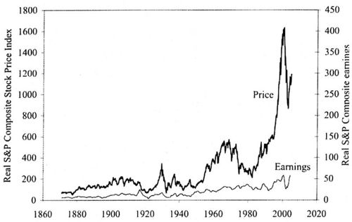
He provides the following graphic which shows that the rise and fall of the stock market between 1990 and 2000 qualifies as a speculative bubble.

Real (inflation-corrected) S&P Composite Stock Price Index, monthly, January 1871 through January 2005 (upper curve), and real S&P Composite earnings (lower curve) January 1871 to September 2004.
In the preface of this second edition Shiller writes:
A number of people who read the book (first edition) have told me they think this book addressed a much broader subject. They are right: This book is really about the behavior of all speculative markets, about human vulnerability to error, and about the instabilities of the capitalist system.
Shiller demonstrates this by showing that his arguments suggest that the housing market is in a speculative bubble, with the implication that the bubble might burst bringing down the price of houses.
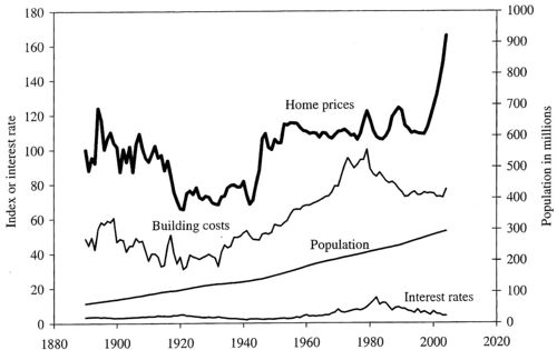
Shiller remarks that most people believe that the price of a house can only go up. To dispel this belief he and his students obtained data on housing costs back 1890 and provide the following graphic:

Heavy solid line: real (inflation-corrected) home price index, 1890 = 100, for the United Sates; thin line: real bulding cost index, 1979 = 100; lowest line: long term inerest rate.
The most striking thing we notice is the sharp increase in house prices since the 1990's. There was a 52% increase in housing prices betweeen 1997 and 2004. Only one other similar increase occured after World War II, which was probabily caused by the fact that the GI Bill guaranteed loans for purchasing or building a home, or for repairs or improvements to existing homes.
Shiller also notes that the "rocket taking off" of housing prices cannot be explained from this graph by increased bulding costs, inceased population, or interest rates. He says that the ascent in home proces after 1997 was much faster than the increase in incomes.
It is hard to understand why this apparent speculative bubble exists. Shiller notes that it does not occur in all cities. To domenstrate this, he looked at home prices in a sample of 6 major cities and found the following results.
When we look at individual states we do not find a s [....????] Note that, taking into account inflation, in the period from 1880 to 2005 the prices have been essentially flat except for two periods, [...]
Shiller remarks that it is hard to understand how such an increase in house prices could occur. The increase after 1997 was much faster than the increase in incomes.
To be continued.
Just how reliable are scientific papers?
Scientific accuracy ...and statistics, The Economist, 3 September 2005.
Why Most Published Research Findings Are False
(pdf version), John P. A. Ioannidis
John Ioannidis, an epidemiologist, claims that 50% of scientific papers eventually turn out to be wrong.
While it is known that science is a Darwinian process, proceeding as much by refutation as by publication, no one has tried to quantify this issue until recently. The author sets out to understand how frequently highly cited studies are contradicted.
"There is increasing concern that, in modern research, false findings may be the majority or even the vast majority of published research claims," says Ioannidis in a related analysis, Most published research findings may be false, which appears in PLoS Medicine an open access, freely available international medical journal. (The Public Library of Science (PLoS), which publishes The PLoS Medicine is a non-profit organization of scientists and physicians committed to making the world's scientific and medical literature a freely available public resource.)
Ioannidis examined 49 articles which were cited at least 1,000 times in widely read medical journals between 1990 and 2003. But 14, about a third, were later refuted, such as hormone replacement therapy safety (it was, then it wasn't), vitamin E increasing coronary health (it did, then it didn't) and the effectiveness of stents in balloon angioplasty for coronary-artery disease (they are, but not as much as first claimed).
One source of error is unsophisticated reliance on "statistical significance," since twenty randomly chosen hypothesis are likely to result in one or more statistically significant results. In fields like genetics where thousands of possible hypothesis, genes that contribute to a particular disease, are examined, many (false) positive results will routinely occur purely by chance.
Other factors contribute to false results. One driving factor is sample size. "The smaller the studies conducted in a scientific field, the less likely the research findings are to be true," says Ioannidis. And another factor is effect size, such as drugs that work only on a small number of patients. Research findings are more likely to be true in scientific fields with large effects, such as the impact of smoking on cancer, than in scientific fields where postulated effects are small, such as genetic risk factors for diseases where many different genes are involved in causation. If the effect sizes are very small in a particular field, says Ioannidis, it is "likely to be plagued by almost ubiquitous false positive claims."
The author goes on to define a mathematical model to quantify sources of error. He concludes that a large, well-designed study with little researcher bias has only an 85% chance of being right. A small sample, poorly performing drug with researcher bias has only a 17% chance of reaching the right conclusions. And over half of all published research is probably wrong.
The author states his overall conclusions as follows:
- Contradiction and initially stronger effects are not unusual in highly cited research of clinical interventions and their outcomes. The extent to which high citations may provoke contradictions and vice versa needs more study. Controversies are most common with highly cited nonrandomized studies, but even the most highly cited randomized trials may be challenged and refuted over time, especially small ones.
In their related editorial, the PLoS Medicine editors discuss the implications of Ioannidis' analysis. They agree with him in some respects. They write, "publication of preliminary findings, negative studies, confirmations, and refutations is an essential part of getting closer to the truth." And the editors "encourage authors to discuss biases, study limitations, and potential confounding factors. We acknowledge that most studies published should be viewed as hypothesis-generating, rather than conclusive."
The original paper Contradicted and Initially Stronger Effects in Highly Cited Clinical Research, appeared in the Journal of the American Medical Association in July 2005. and is available on line for subscribers. The abstract is available on-line.
A related Guardian (September 8, 2005) article is Don't dumb me down. It states:
- Statistics are what causes the most fear for reporters, and so they are usually just edited out, with interesting consequences. Because science isn't about something being true or not true: that's a humanities graduate parody. It's about the error bar, statistical significance, it's about how reliable and valid the experiment was, it's about coming to a verdict, about a hypothesis, on the back of lots of bits of evidence.
In fact, the Guardian has a web page with weekly articles devoted to bad science. You are invited to make submissions. "If you are a purveyor of bad science, be afraid. If you are on the side, of light and good, be vigilant: and for the love of Karl Popper, email me every last instance you find of this evil. Only by working joyously together can we free this beautiful, complex world from such a vile scourge."
Discussion
Dr Ioannidis's study focuses on medical research only. Would the same conclusions be applicable to other sciences such as physics or is there an inherent bias in his research?
The Economist article finishes by asking, "Is there a less than even chance that Dr. Ioannidis's paper is itself wrong?"
Submitted by John Gavin.
Paulos on errors in medical studies
Why medical studies are often wrong; John Allen Paulos explains how bad math haunts heath research
Who's Counting, ABCNews.com, 7 August 2005
In this installment of his online column, Paulos considers the JAMA report about contradictions in health research (Ioannidis, J.P.A. Contradicted and initially stronger effects in highly cited clinical research. JAMA, July14, 2005; 294:218-228 ). This research is well described above.
In the present article, Paulos cites a number of reasons for the problems. A single study is rarely definitive, but headlines and soundbites usually don't wait for scientific consensus to develop. People fail to appreciate differences in quality of research. Experiments are stronger than observational studies; in particular, surveys that depend on patients' self-reporting of lifestyle habits can obviously be unreliable. These ideas echo points made by the medical journals themselves in response to news reports (see, for example, see this Associated Press report).
Paulos also describes some conflicting psychological responses to medical news. People can be overly eager to believe that a new treatment will work. On the other side of the coin, in what he calls the "tyranny of the anecdote," people also overreact to stories of negative side-effects, even though such incidents may be isolated.
DISCUSSION QUESTION:
On the last point, Paulos writes:
A distinction from statistics is marginally relevant. We're said to commit a Type I error when we reject a truth and a Type II error when we accept a falsehood. In listening to news reports people often have an inclination to suspend their initial disbelief in order to be cheered and thereby risk making a Type II error. In evaluating medical claims, however, researchers generally have an opposite inclination to suspend their initial belief in order not to be beguiled and thereby risk making a Type I error.
Do you understand the distinction being drawn? To what hypotheses does this discussion refer?
Poor people receive worst public services
In the UK, it seems that the poorer you are the less likely you are to have access to public services, such as health care. This counter intuitive result is known as the "inverse care law" - those in greatest need have the worst services. A new set of reports from the Joseph Rowntree Foundation (JRF) sets out to graphically illustrate the nature and extent of geographical and social inequality in the UK at the beginning of the twenty-first century.
This study addresses inequalities using data from the 2001 Census, such as the geographical relationship between poverty, affluence and area. Appropriate Census data were extracted from the Census database and their distribution explored using maps, graphs and charts.
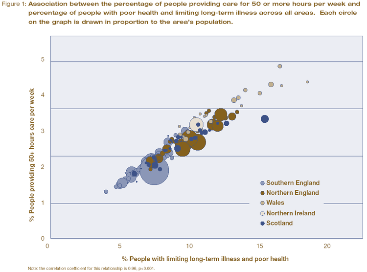
For example, 4.5 million people in the UK reported that they had both poor health and a limiting long-term illness in 2001. 5.9 million people said they provide care to family and friends on an informal basis. The amount of this informal care is provided in direct proportion to the rate of poor health in areas across the UK. The authors use a carefully constructed graph, based on census data, to illustrate the strong relationship between the two social variables.

Another report, Life in Britain, provided a geographical graph of the ‘inverse care law’. The authors use geographic data from the 2001 cencus to highlight that higher numbers of practising, qualified medical practitioners tend to live and work in areas where the rates of illness are lower.
In both figures, the cartograms on the left shows each area in proportion to its population in 2001. The largest area is London, as it has the highest population density. The right hand map shows the actual boundaries of the areas.
The authors comment on the graph that "perversely, people living in the poorest neighbourhoods with the greatest needs are often the least likely to have access to the services and support that would help them improve their lives." Given these results, the authors are not surprisingly very negative on their views of social equality in the UK today. Prof. Dorling said "it is acutely disappointing to discover that so many opportunities and resources still depend on where people live." And Dr Ben Wheeler, also from the University of Sheffield, said that "the census data shows quite clearly that although living standards have increased in 60 years, the rich and poor in Britain continue to live in two different worlds."
These graphs demonstrates the power of the Census to provide easily interpreted data that consider the entire population and make obvious the continued unequal distribution of resources and prospects in the UK today.
The authors advocate the use of simple quantitative methods throughout their work, the most complex being correlation coefficients. Typically, they use pairs of variables, derived from the Census data, are compared across the geographical areas, with most pairs representing one measure of need and one measure of availability. The objective is demonstrates associations rather than proving causes.
A related ‘inverse education law’ also appears to exist in the case of education. Areas which have the highest proportions of young people with no qualifications tend to have the fewest teachers available.
Further reading
Guardian Unlimited,
Matt Weaver, September 1, 2005.
JRF report: poverty, affluence and area (pdf file), Dr Ben Wheeler and Professor Danny Dorling from the University of Sheffield, Dr Mary Shaw from the University of Bristol and Dr Richard Mitchell from the University of Edinburgh.
Life in Britain
JRF report: Life in Britain A pack summarising the results of the analysis of the UK 2001 Census data was published by The Policy Press. It is intended for use by students, their teachers and a wide range of practitioners and policy makers, and consists of 10 short reports, a summary, a technical report and 5 A2 posters.
Some parts of some Joseph Rowntree Foundation reports are available on-line and are well worth reading. For example, Thomas Clarkson won a prize in 1785, while he was a student at Cambridge, for An essay on the impolicy of the African slave trade. His essay includes an analysis of the very high rates of mortality (20%) among seamen on board eighty-eight slave ships that returned to Liverpool from their respective voyages in September 1787. This analysis was intended to counter the then prevalent pro-slavery argument that slave trade provided a nusery for British seamen. He includes some chilling graphics on life for slaves on board as well. This essay provoked him to pursue the goal of the abolition of slavery. This link also provides an harrowing extract from his book, History of the abolition of the African slave trade, which was first published in 1817, in which he gives more details of conditions of the lives of slaves.
Discussion
Do you think that a lack of doctors lead to areas with generally poor health, or are areas with generally poor health unattractive places for doctors for they live, causing them to relocate elsewhere?
Submitted by John Gavin.
Statistics could have spotted mass murderer
NewScientist.com news service,
John Pickrell, 06 September 2005.
Plotting death
Emma Young, New Scientist, 09 February 2001.
In 2000 Harold Shipman, a UK family doctor, was convicted of murdering 15 patients. Statistical quality-control methods might have allowed authorities to catch Shipman much sooner, according to a new study. David Spiegelhalter of the UK Medical Research Council's Biostatistics Unit, Cambridge, UK, has applied an industrial quality-control technique to data on the death of Shipman's patients to see if his heinous crimes could have been detected any earlier. "The method was first used in 1943 to ensure consistent quality in explosive shells and other wartime munitions production lines", says Spiegelhalter. The same statistics are used today in a wide range of industries, but have never before been applied to healthcare performance.
These methods on their own are not enough but cross-referencing other factors such as time of death or location might have set alarm bells ringing – many of Shipman's victims were murdered at around 3pm, during his afternoon rounds, and anomalous numbers died while in Shipman’s presence. "Maths has many crime-fighting applications," comments applied mathematician Chris Budd at the University of Bath, UK. "Statistics can be a useful approach for detecting anomalies in many contexts," he says.
The control-chart graphical method was developed by US physicist Walter Shewhart for use in the manufacturing industry. Scores are not ranked into a league table. Instead, the number of adverse outcomes is plotted against the total number of cases on a graph. A line is drawn through the mean, and all scores within three standard deviations (in practice, most of the scores) are considered to be down to inherent variation in the system. Any scores outside the 'control limits' suggest a special cause. "This tells you where the real problems in a system are," Tom Marshall, of the University of Birmingham, told New Scientist. "In a league table, someone has to be at the top and someone has to be at the bottom, but that doesn't necessarily mean any kind of intervention should be taken."
However, Spiegelhalter believes his method is more powerful as it allows data from multiple years to be assessed simultaneously, which the other method does not allow.
These methods can also be used to uncover awful surgeons or poorly-performing hospitals and are now being tested in pilot schemes by the UK's Healthcare Commission, an independent body which monitors public health services.
But the UK Department of Health's argues that while the technique is widely used in industry, it may be too simplistic for use with hospital data: "The very simplicity of the technique's approach and application means it may not be the best technique to apply universally within the more complex environment of the NHS."
Marshall thinks that decades of effective use in manufacturing proves the robustness of the approach. "In the 1950s, the technique was taken to Japanese car manufacturers, who were producing pretty poor quality cars. They were told that if they adopted this approach, they'd be beating the world in two to three decades. The rest is history."
Further reading
Funnel plots for institutional comparison, D Spiegelhalter, Letter to the editor, Qual. Saf. Health Care, 2002.
Serial killers
The Economist (subscription required), Sep 1st 2005.
The Shipman inquiry blamed lax controls on opiate drugs, Shipman's weapon of choice in as many as 260 murders. As a result, Airedale General Hospital in West Yorkshire decided to audit its supplies—and discovered that it might be harbouring its own serial killer.
Statistical process control tools for monitoring clinical performance, T. O. Lim, International Journal for Quality in Health Care, 2002.
Submitted by John Gavin.
