Chance News 95
Quotations
“It is worth dwelling for a moment on Egon [son of Karl] Pearson’s first-year lecture course …. [H]e was an inspirational teacher …. What was the reason for his success? [H]e was not a teacher who ladled out cookery-book recipes; rather he always seemed in his lectures to be working through and exploring problems with the class. He would wander down enticing dead-ends, but return to seek alternatives again and again until a satisfactory approach had been established. The result was that students acquired a questioning approach, not a compartmentalized approach whereby one problem was allocated to a 2 x 2 table, the next to multiple linear regression, etc.”
(1994 presidential address to the RSS)
Submitted by Margaret Cibes
“In my own field of flood risks, a talented statistician declared: ‘It is also true that for extremely rare events, correct uncertainty estimates may lead us to conclude that we know virtually nothing. This is not such a bad thing. If we really know nothing we should say so!’”
Submitted by Margaret Cibes
“For emotionally significant events, the size of the probability simply doesn’t matter. What matters is the possibility of winning. People are excited by the image in their mind. The excitement grows with the size of the prize, but it doesn’t diminish with the size of the probability.”
Submitted by Bill Peterson
"Often what is important about a statistical method is not what it does with the data, but rather what data it uses."
Submitted by Paul Alper
Another quote from Andrew Gelman, with potential relevance beyond social science research papers ....
".... High-profile social science research aims for proof, not for understanding - and that's a problem. .... But the incentives also favor silly causal claims. In many social sciences, it's not enough to notice an interesting pattern and explore it .... Instead, you are supposed to make a strong causal claim, even in a context where it makes little sense. In summary, I see the ethical problem in our publication system, in which the appearance of definitive argument is valued over open exploration. Authors are encouraged to see potential criticisms not as open questions to pursue, but as 'threats to validity' to be quashed. .... A research paper is more than a series of hypotheses and a data dump."
Chance, 2013 (#2)
Submitted by Margaret Cibes
Forsooth
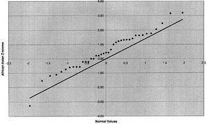
from “Ethnicity and Human Genetic Linkage Maps”, American Journal of Human Genetics, February 2005

The New York Times, August 24, 2013
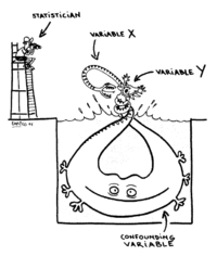
Submitted by Margaret Cibes and James Greenwood
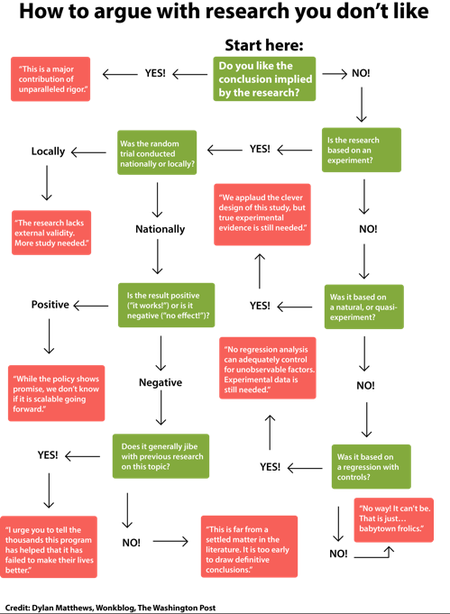
Washington Post Wonkblog, 12 September 2013
Submitted by Paul Alper
Weeding wedding invitation lists
“GUESTimation: Breaking the deadlock on wedding guest lists”
by Damjan Vukcevic, Significance, August 2013
Winner of the second annual Young Writers Competition, this article describes the process the author used to narrow his initial wedding guest list down to a number that his venue could accommodate. The process included grouping potential invitees (e.g., families), ranking them for their probabilities of attending if invited (to Australia), and using a probability distribution of the number of attendees to get a confidence interval of attendees. He also discusses his independence assumption and the consequence of using or not using it.
Submitted by Margaret Cibes
Civil rights and Simpson's paradox
Mary Parker sent this example of Simpson's Paradox to the Isolated Statisticians list:
Were Republicans really the party of civil rights in the 1960s?
by Harry J. Enten, Guardian, 28 August 2013
The 50th anniversary of the March on Washington and Martin Luther King's famous "I have a dream speech" have been commemorated in much recent news coverage. In light of some Republican claims that their record on civil rights compares favorably to Democrats, the Guardian takes a statistical look at the voting record on the landmark Civil RIghts Act of 1964.
The article presents 3 tables, which are reproduced below. The first breaks out the vote by party in the House of Representatives and the Senate, indicating that the bill had greater support among Republicans.
1964 Civil Rights Act Senate Version Ayes Democrats Republicans House 153 of 244 (63%) 136 of 171 (80%) Senate 46 of 67 (69%) 27 of 33 (82%)
The second table takes into account the history of the Civil War, separating out the 11 southern states that formed the Confederacy (note the remaining 39 states are classified as "Union", but of course not all of these current states existed in the 1860s).
1964 Civil Rights Act Senate Version Ayes Union Confederacy House 281 of 313 (90%) 8 of 102 (8%) Senate 72 of 78 (92%) 1 of 22 (5%)
Observing that political party and geography both matter, the Guardian's third table accounts for both:
1964 Civil Rights Act Senate Version Ayes Dem/Union Rep/Union Dem/Confed Rep/Confed House 145 of 152 (95%) 136 of 161 (85%) 8 of 91 (9%) 0 of 11 (0%) Senate 45 of 46 (98%) 27 of 32 (84%) 1 of 21 (5%) 0 of 1 (0%)
This gives an example of Simpson's Paradox. In both the north and the south, the bill had stronger support among Democrats than Republicans. However, aggregating over region leads to the first table, which reverses the direction of the association. The explanation is that a larger proportion of Democrats came from the south (in the House, 91 of the 244 Democrats came from the South, compared with only 11 of the 171 Republicans), where support for the Civil Rights Act was much weaker.
[Note. In the original Guardian article, the third table gives the Dem/Union count in the House as 144, which leaves the Aye total for Democrats one vote short of the first table. Nick Horton alertly noticed this and wrote to the author, who subsequently identified the missing vote as a Pennsylvania Democrat whose party affiliation was listed as "unknown" in one of the voting databases and erroneously wound up in Republican count. Thanks to Nick for communicating the correction to the Isolated Statisticians list.]
Curious quotation on correlation
Margaret Cibes sent the following passage from The Big Short: Inside the Doomsday Machine, by Michael Lewis (Norton, 2011):
At issue was how highly correlated the prices of various subprime mortgage bonds inside a CDO might be. Possible answers ranged from zero percent (their prices had nothing to do with each other) to 100 percent (their prices moved in lockstep with each other). Moody’s and Standard Poor’s judged the pools of triple-B-rated bonds to have a correlation of around 30 percent, which did not mean anything like what it sounds. It does not mean, for example, that if one bond goes bad, there is a 30 percent chance that the others will go bad too. It means that if one bond goes bad, the others experience very little decline at all. [pp. 207-208, emphasis added]
Discussion
What do you make of the last sentence? Is this a Forsooth?
Talk and interview by Proofiness author
Charles Seife is the acclaimed author of Proofiness: The Dark Arts of Mathematical Deception. A Chance News review may be found here.
Here is a link to a video of his hour-long lecture given at Google’s New York office. The title of his presentation is “Context is Everything-More About the Dark Arts of Mathematical Deception.”
This web site also refers one to a 26 minute New Zealand radio interview which is entitled, “Numbers Don’t Lie, But People Do.”
Submitted by Paul Alper
US population pyramid - interactive over time
Margaret Cibes sent the following from the Daily Kos:
Demographics: Today's cool bit of data visualization comes from the Census Bureau, which has turned the nation's age and gender composition over the last century into an animation. The best part is watching the bulge from the Baby Boom generation pass through the century's midsection, much like watching a snake digest a rat.
Here is a static screen grab from 1999, but you should view the whole animation at the link above. See also the bottom of that page for links to other Census data visualizations.
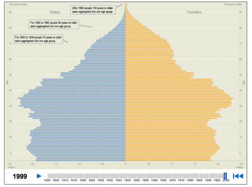
An earlier Chance News discussion of population pyramids can be found here. Included there is a link instructions for creating your own pyramid plots in R or SAS.
Radical cartography
On a related theme, Margaret sent the following examples from Bill Rankin's intriguing Radical Cartography website:
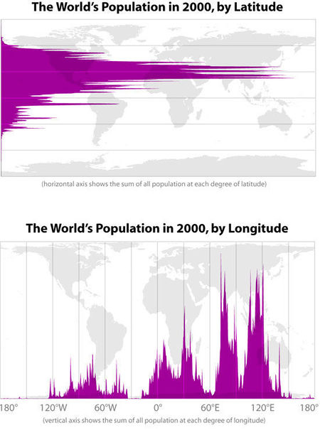
There are many great plots to explore here.
Coffee and a Forsooth!
Paul Alper sent the following Forsooth about coffee drinkers:
- "Men who drink more than four cups a day are 56 per cent more likely to die."
The quotation is from Coffee quaffers face increased death risk: study (New Zealand Herald, 18 September 2013). The study in question is Association of coffee consumption with all-cause and cardiovascular disease mortality (Mayo Clin Proc. 15 Aug 2013).
The whole discussion drew commentary on Andrew Gelman's blog Is coffee a killer? I don’t think the effect is as high as was estimated from the highest number that came out of a noisy study. Andrew observes that the Herald's claim of increased mortality risk, as quoted above, "is obviously not true: deaths, as we’ve observed before, are fixed at one per customer." He also writes:
On the plus side, it [the study] says “the statistics have been adjusted to remove the impact of smoking.” I hope they did a good job with that adjustment. Smoking is the elephant in the room. If you don’t adjust carefully for smoking and its interactions, you can pollute all the other estimates in your study.
Paul comments that "coffee drinking must be the most studied habit in the statistical world." He sent a link to a TED talk by Ben Goldacre contrasting various health conclusions. In the first minute Goldacre presents a slide where coffee is listed as both causing and curing cancer!
Goldacre is the author of the "Bad Science" column in The Guardian; some of these pieces have been mentioned in earlier Chance News. His web site includes archives of these articles and much more.