Chance News 91
Quotations
Forsooth
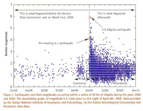
Aquila earthquake chart
“The L’Aquila earthquake: Science or risk on trial”
by Jordi Prats, Significance magazine, December 2012
Prats discusses the April 2009 Italian earthquake during which about 300 residents lost their lives. Readers will recall news about the 13-month trial of the six scientists (and a government official), who were each sentenced to six years in prison for “providing ‘inaccurate, incomplete and contradictory information’ on the probability and risk of an earthquake and for falsely reassuring the population.” (See “The perils of failed predictions”, Chance News 89, October-November 2012.)
Prats reports that, according to the Italian Macroseismic Database, "L’Aquila has suffered earthquakes of magnitude 6 or higher on 13 occasions in the period 1315-2005, approximately every 50 years." Also, he reports that, according to a 1988 seismology paper, “Alarm systems based on a pair of short-term earthquake precursors”, "[T]he probability of a weak shock or swarm being followed by a major shock in the following 2-5 days is very low, of the order of 1-5%."
Prats believes that the most important information for the public would have been the risk (in the sense of expected loss) of an earthquake, and not the just its likelihood, because such a risk assessment would have included both the probability of an earthquake and the expected loss in the event of an earthquake.
In any case, Significance Editor Julian Chamkin has given permission to post the following chart from the article (email of January 14, 2013):

Discussion
1. Based on the chart, would you have recommended that the Aquila public be informed, in March or April of 2009, that they should be prepared for a serious earthquake? (Note that, according to Wikipedia[1], someone who made a March 2009 prediction of a major earthquake was accused of being "alarmist," and “forced to remove his findings from the Internet.”)
2. Consider the Challenger spacecraft disaster in 1986. The O-ring chart made famous by Edward Tufte[2] suggested potential problems with launching a spacecraft at the near-freezing temperature at which it was actually launched. An online article, “Representation and Misrepresentation: Tufte and the Morton Thiokol Engineers on the Challenger”, discusses the role of the engineers in that decision, with respect to the information available to them and to their professional ethical responsibilities. Interested readers may also check out a Berkeley professor's Q&A activity sheet, “Challenger O-Ring Data Analysis”, about the Challenger O-ring issue.
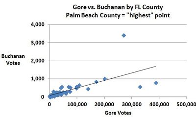
3. While we're on the topic of decision-making based, at least partially, on charts, see the chart below, which shows U.S. presidential election results in Florida for a major-party (Gore) and minor-party (Buchanan) candidate. Based on the chart, what might you have recommended to an election official? See "Why Usability Testing Matters".

Submitted by Margaret Cibes
Re #3, Bill Peterson called attention to the article, "Voting Irregularities in Palm Beach, Florida", Chance magazine, 2001, which contains a similar chart comparing Buchanan's votes in the 1996 primary to those in the 2000 election.