Chance News 110: Difference between revisions
| Line 31: | Line 31: | ||
---- | ---- | ||
“[Richard] Florida finds that this population [service workers] currently splits its vote evenly between the two parties — ''no statistical significance for either Trump or Clinto''n. ” | “[Richard] Florida finds that this population [service workers] currently splits its vote evenly between the two parties — ''no statistical significance for either Trump or Clinto''n. ” | ||
Revision as of 21:33, 28 June 2017
January 1, 2017 to June 30, 2017
Quotations
“What people do not understand,” he explained: “If you control the denominator, you control everything.”
Statisticians fear Trump White House will manipulate figures to fit narrative, Guardian, 30 January 2017
Submitted by Margaret Cibes
“When a coincidence seems amazing, that’s because the human mind isn’t wired to naturally comprehend probability and statistics.”
"What Thursday revealed is that polls struggle to capture the crucial nuances of politics today: there’s no longer a single story in Britain – and averages are dead."
"They [new planet candidates] are fascinating, but Kepler’s mission is not to pinpoint the next tourist destination — it is to find out on average how far away such places are. Or, as Dr. Batalha said, We’re not stamp collecting, we’re doing statistics.”
Forsooth
“The president, he’s not focused on statistics as much as he is on whether or not the American people are doing better as a whole.”
“[Richard] Florida finds that this population [service workers] currently splits its vote evenly between the two parties — no statistical significance for either Trump or Clinton. ”
Statistical artifacts
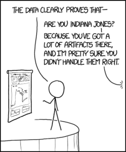
Artifacts (from XKCD)

Suggested by Michelle Peterson
Crowd size
From Lincoln to Obama, how crowds at the capitol have been counted
by Tim Wallace, New York Times, 18 January 2017
This article anticipates the controversy that ensued from Trump's claims about the size of the crowd for his inauguration. There is a nice historical retrospective here, starting with Lincoln's inauguration. Period photographs have now been studied using modern tools like Google Earth to give an estimate of 7350 attendees.
Controversy over crowd estimates is also nothing new. It's now been more than 20 years since Louis Farrakhan's Million Man March in 1995. His supporters threatened to sue the National Park Service for giving an estimate of only 400,000. In the aftermath, the Park Service stopped providing official estimates.
In Crowd estimates from Chance News 68, we described Glenn Beck's 2010 rally and event held in response by John Stewart and Stephen Colbert. A Washington Post story at the time gave an annotated graphic of the satellite photo analysis of Barack Obama's 2009 inaugural. The present NYT article notes that satellite analyses have become more common since that time.
The NYT also references a Scientifc American discussion, The simple math behind crunching the sizes of crowds. Writing as their "Math Dude," Jason Marshall says "I feel that it’s important to note that estimating crowd sizes is a solved problem that’s actually pretty straightforward."
Of course, when the estimate becomes a proxy for political support, things are not so straightforward. Among other things, the 2017 inaugural may be remembered as the event that gave us the phrase alternative facts.
Still thinking about the election
Margaret Cibes sent a link to the following:
- The 2016 national polls are looking less wrong after final election tallies
- by Scott Clement, Washington Post, 6 February 2017
Gender stereotypes
Nick Horton sent the following to the Isolated Statisticians list-serv:
Gender stereotypes about intellectual ability emerge early and influence children’s interests
by Lin Bian, Sarah-Jane Leslie, Andrei Cimpian, Science, 27 January 2017
The full article requires a subscription. From the summary on the web page we read:
The distribution of women and men across academic disciplines seems to be affected by perceptions of intellectual brilliance. Bian et al. studied young children to assess when those differential perceptions emerge. At age 5, children seemed not to differentiate between boys and girls in expectations of “really, really smart”—childhood's version of adult brilliance. But by age 6, girls were prepared to lump more boys into the “really, really smart” category and to steer themselves away from games intended for the “really, really smart.”
Nick recommended this study for use in class for a number of reasons, including the fact that available for download from the Open Science Framework, and the analyses are quite accessible with tools such as the t-test and the chi-squared test.
Here is a newspaper story about the study:
- Why young girls don’t think they are smart snough
- by Andrei Cimpian and Sarah-Jane Leslie, New York Times, 26 January 2017
Hans Rosling
Margaret Cibes sent a link to the following:
- Hans Rosling, Swedish doctor and pop-star statistician, dies at 68
- by Sam Roberts, New York Times, 9 February 2017
With his celebrated Gapminder presentations, Rosling invited us to "Pour the sparkling fresh numbers into your eyes and upgrade your worldview."
Gaussian correlation inequality
Pete Schumer sent a link to the following:
- A long-sought proof, found and almost lost
- by Natalie Wolchover, Quanta, 28 March 2017
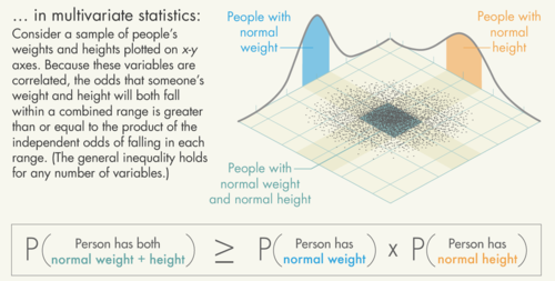
Thomas Royen, a retired German statistics professor, has published a proof for the Gaussian correlation inequality, a result originally conjectured in the 1950s. The Quanta article gives an engaging description of Royen's discovery and the path to getting the result published. There is also a nice illustration a simple case with a bivariate normal distribution

The general result involves an n-dimensional normal distribution, and the intersection of two convex sets that are symmetric about the center of the distribution. In the example 2-dimensional example above, the sets are the two infinite strips (light shading), which intersect in a rectangle (dark shading).
Royen's original paper is short but still quite technical. This post at George Lowther's 'Almost Sure' blog provides useful additional context for the result.
Spotting bad statistics
Priscilla Bremser recommended the following TED talk:
- 3 ways to spot a bad statistic, by Mona Chalabi
Chalabi is data editor of the Guardian US. In this short (under 12 minutes) and very entertaining talk, she describes describes the problem society faces when policymakers can't get agreement on baseline statistical facts.
In between blindly accepting or reflexively denying any data-based claim, she describes three points to remember when evaluating statistics.
- Can you see uncertainty?
- Can I see myself in the data?
- How was the data collected?
Regarding uncertainty, she discusses the reasons that opinion polling has become more difficult, and wonders why the probability of a Hillary Clinton win was reported "with decimal places." On seeing yourself in the data, she notes that reporting only averages frustrates people who don't see their own experience represented. There is a very memorable quote in the section on data collection, where she observes that for one cosmetics commercial L'Oreal was happy to talk to just 48 women to "prove" that their product worked. She says:
Private companies don't have a huge interest in getting the numbers right, they just need the right numbers.
Flint water crisis
The murky tale of Flint's deceptive water data
by Robert Langkjær-Bain, Significance, 5 April 2017
A subtitle reads, "This is a cautionary tale of how flawed and inadequate testing creates misleading data." The crisis of lead contamination in the Flint Michigan water supply has been unfolding for three years. The Significance article does a good job summarizing the history, and explaining how poor data anlysis exacerbated the problem. In 1991, the EPA's lead and copper rule specified that action had to be taken if lead levels exceeded 15 parts per billion in 10% of customer taps sampled.
According to official data from the Michigan Department of Environmental Quality, the 10% threshhold was not exceeded. However, mistakes were uncovered at every stage of the process. While samples were supposed to be taken on homes actually served by lead pipes, official records were not clear on which homes fell in this category. Moreover, in tests covering the period January to June of 2015, two samples were removed from a set of 71, since they officials to be "outliers." Both measured above 15 ppb of lead, and their removal changed the percentage above that level from being above 10% to below. A before and after dotplot was presented in What went wrong In Flint (by Anna Maria Barry-Jester, FiveThirtyEight, 26 January 2016).
As described in the Significance and FiveThirtyEight, citizens concerned about the water quality initiated their own investigations. A recent study by the Pew Research Center seeks to track how the public engaged with the story over time:
- Q&A: Using Google search data to study public interest in the Flint water crisis
- by John Gramlick, Pew Research Center, 27 April 2017.
The article discusses the challenges of interpreting search data. For example
[I]n keyword searches, terms must be exact, which means that every conjugation of a word or combination of words needs to be entered separately. For example, if someone wants to see search activity around “lead testing,” you need to enter “lead tests,” “lead testing,” “lead tested” and “lead test.” For us, this meant using nearly 2,700 different search terms.
Another aspect of the study examined news coverage of the crisis.
Most recently, in June, the Detroit Free Press reported that five state and local officials had been charged with involuntary manslaughter for a death from Legionnaire's disease linked to the water crisis. Ongoing coverage of the Flint investigations can be found at the Flint Water Study Updates website.
Same stats (think Anscombe)
Jeff Witmer sent the following link to the Isolated Statisticians list.
- Same stats, different graphs: Generating datasets with varied appearance and identical statistics through simulated annealing
- by Justin Matejka, ACM SIGCHI Conference on Human Factors in Computing Systems
Observing that it is not known how Frank Anscombe went about creating his famous quartet of scatterplots, the authors present the results of their simulated annealing technique to produce some striking visualizations. You'll want to see the Datasaurus Dozen, which even has an R data package.
The fivethirtyeight package for R
fivethirtyeight Package
by Albert Y. Kim, Chester Ismay, and Jennifer Chunn, announced 13 March 2017
The authors have developed a package for pedagogical use that provides data from FiveThirtyEight.com stories in an easy-to-access format, along with R code to reproduce the analyses. Their goal is to allow students to get into the data with minimal overhead.
This should be a very valuable resource for teaching about statistics in the news! Here is a quick illustration of how to use the package. More details are available in the package vignette linked above.
Deaths of despair
The forces driving middle-aged white people's 'deaths of despair'
by Jessica Boddy, NPR Morning Edition, 23 March 2017
In Middle-age white mortality (Chance News 108) we discussed the surprising findings of Anne Case and Angus Deaton on white mortality rates, as presented in their 2015 paper. "Deaths of despair" is the phrase they are using to describe deaths in middle age attributable to suicide, drugs and alcohol. NPR inteviewed Case and Deaton about their new paper, Mortality and morbidity in the 21st century, which explores the possible causes for the trend.
The original paper received wide media attention, with many commenters citing the dim economic prospects of those with a high school degree or less as a likely explanation. However, Case and Deaton point out that this effect should cut across racial groups, whereas Hispanics and blacks have not experienced the mortality increases observed for whites. Quoting from the summary to their new paper
We propose a preliminary but plausible story in which cumulative disadvantage over life, in the labor market, in marriage and child outcomes, and in health, is triggered by progressively worsening labor market opportunities at the time of entry for whites with low levels of education.
In this sense, the mortality trends can be linked to the decline of the white working class since the 1970s.
Is white mortality really rising?
Stop saying white mortality is rising
by Jonathan Auerbach and Andrew Gelman, Slate, 28 March 2017
This article presents an alternative point of view. Auerbach and Gelman are not dismissive of Case and Deaton's research, which they regard as important. But they argue that the data set is quite rich, and to summarize it broadly in terms of "white mortality" blurs important details. Our earlier Chance News post includes Gelman's observation that non-Hispanic white women as a group were the main drivers of the observed trend. In the present article, they investigate further disaggregations, writing
Our plots, showing trends by state, demonstrate in a very simple way that aggregate mortality trends are vague generalizations: There are many winners and losers over the last decade within white middle-aged Americans, or among any other particular group. There are also many relevant ways to slice up these trends, and it’s not clear to us that it’s appropriate to framing these trends as a crisis among middle-aged whites.
The article presents numerous graphs to illustrate this.
Auerbach and Gelman also have concerns about the treatment educational levels. At the low end, the proportion the population not completing high school has been steadily shrinking, so over time we might expect this group to look worse by comparison. They cite a recent research paper, Measuring recent apparent declines In longevity: the role of increasing educational attainment, which observed that "focusing on changes in mortality rates of those not completing high school means looking at a different, shrinking, and increasingly vulnerable segment of the population." By looking instead at the bottom quartile of the education distribution, that paper did not find increased mortality risk.
Interracial marriage
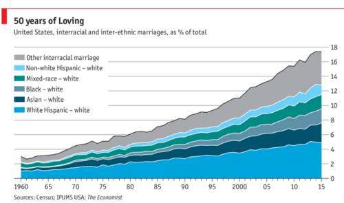
Peter Doyle sent a link to this chart from the Economist:
- Daily chart: Interracial marriages are rising in America
- Economist, 12 June 2017
 ,
,Quoting from the article, one reader commented:
"Of the roughly 400,000 interracial weddings in 2015, 82% involved a white spouse, even though whites account for just 65% of America’s adult population. " If you lump the population into just two groups A and B, 100% of intergroup marriages will involve a spouse from group A, no matter what fraction of the population belongs to group A.
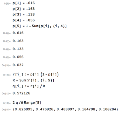
Exercise: 2015 census data is available by googling "us census quickfacts". While the categories don't precisely match those in this piece, you can use this data to get a rough estimate the fraction of interracial weddings that would involve a white spouse under random pairing. What do you get? Is your answer more or less than 82%?
Peter notes that he got just over 82%. Here is his solution (using Mathematica):
