Chance News 97: Difference between revisions
m (→Discussion) |
m (→Discussion) |
||
| Line 118: | Line 118: | ||
|} | |} | ||
</center> | </center> | ||
How | How do these figures affect the interpretation of the ''WSJ'' graph? | ||
Submitted by Bill Peterson | Submitted by Bill Peterson | ||
Revision as of 19:08, 27 January 2014
Quotations
I beseech you, in the bowels of Christ, think it possible that you may be mistaken. --Oliver Cromwell
Cromwell's rule, named by statistician Dennis Lindley, states that the use of prior probabilities of 0 or 1 should be avoided, except when applied to statements that are logically true or false. For instance, Lindley would allow us to say that Pr(2+2 = 4) = 1, where Pr represents the probability. In other words, arithmetically, the number 2 added to the number 2 will certainly equal 4.
Submitted by Paul Alper
"[Choosing] what to do in the face of uncertainty is never a scientific question. The science is elucidating the possibilities and the probabilities but how to act and how to react is your own values. And we always have to make that explicit. But if you don’t have any information, it’s hard to know how to apply your values in more than a random way."
Dot Earth blog, New York Times, 20 December, 2013
Submitted by Bill Peterson
"When you find common errors in the scientific literature – such as a simple misinterpretation of p values – hit the perpetrator over the head with your statistics textbook. It’s therapeutic."
Submitted by Paul Alper
“Uncertainty is an uncomfortable position. But certainty is an absurd one."
"I call myself a Possibilian: I'm open to...ideas that we don't have any way of testing right now."
"Possibilism (philosophy), the metaphysical belief that possible things exist"
Submitted by Margaret Cibes
"The more you are cited the better you are. It is self-evident. QED. But is it? Some academic papers are cited to be debunked."
Submitted by Margaret Cibes
Forsooth
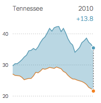
“The difference in mortality rates [in deaths per 100,000 women] between black women [top curve] and white women [bottom curve] with breast cancer has widened since 1975, in part because black women have not benefited as much from improvements in screening and treatment. Among the states with available data, Tennessee has the largest gap—with nearly 14 black women dying for every one white woman.”
The phrase in bold appeared in the printed National Edition (p. A22) but was removed without comment from the online version by Dec. 24. None of the 162 online comments on the accompanying article questioned the phrase.
Submitted by Paul Campbell
How cold was it?
"In Minnesota the temperature was predicted to reach -31F (-35C) but meteorologists warned that accompanying wind chill could make it feel twice as cold…"
"Environment Canada is predicting the vast majority of the country will see below-normal temperatures — and snowfall — through March. In Thunder Bay and the Northwest, the probability of this is seen as between 50 and 60 per cent. Which means the weather office could be only half-right."
Submitted by Bill Peterson
Sham knee surgery study
Common knee surgery does very little for some, study suggests
by Pam Belluck, New York Times, 25 December 2013
The article concerns an arthroscopic procedure to repair a torn meniscus--the cartilage in the knee. According to the article, about 700,000 such surgeries are performed annually, the most for any orthopedic procedure. But is the procedure actually effective? That is the question considered by a study conducted in Finland involving 146 patients at five hospitals. All of the subjects underwent arthroscopic procedures which involved making an incision and inserting a scope to assess the injury. However, at this point, it was randomly determined whether the meniscus would actually be trimmed or if a false blade would be rubbed on the knee cap as a sham treatment. The subjects did not know which treatment they got. In follow-up interviews a year later, comparable proportions of each reported that the procedure had improved their condition, and said that they would have it again, even though it might be a sham treatment.
The following quotation comes from a related story in the Wall Street Journal:
- "Doctors have a bad tendency to confuse what they believe with what they know," said Dr. Järvinen [one of the study's authors], an orthopedic resident and adjunct professor at Helsinki University Central Hospital.
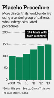
The WSJ article also included the following graphic to illustrate the increasing use of sham surgery as a control.

Submitted by Paul Alper
Discussion
1. What particular concerns might you have with sham surgical treatments (as opposed to less invasive placebo treatments like sugar pills)? For more on this, see Sham procedures and the ethics of clinical trials (Journal of the Royal Society of Medicine, December 2004).
2. The WSJ graphic cites CinicalTrials.gov, which describes itself as "a registry and results database of publicly and privately supported clinical studies of human participants conducted around the world." On that web site we find the following data on trends over time
| Year | Total Number of Registered Studies | Total Number of Registered Studies with Posted Results |
|---|---|---|
| 2008 | 66,309 | |
| 2009 | 83,481 | 1,822 |
| 2010 | 101,210 | 3,529 |
| 2011 | 119,422 | 5,941 |
| 2012 | 138,960 | 8,768 |
| 2013 | 158,772 | 11,110 |
How do these figures affect the interpretation of the WSJ graph?
Submitted by Bill Peterson
The Distributome Project
The Distributome Project is a collection of web-based resources for teachers and students of probability, statistics, and partner disciplines.
The heart of Distributome is a digital library of special, parametric probability distributions. Properties of distributions, and relations between distributions, are stored in an XML database. Properties of a distribution include density, distribution, quantile, and generating functions; various moments, such as mean, variance, skewness, kurtosis, and entropy; median and other special quantiles; and so forth. Relations between distributions are classified in various standard ways, such as special cases, transformations on underlying random variables, limits of random variables or parameters, and conditioning.
Built from the database are a number of innovative features and ancillary resources:
- The Navigator is a dynamic, graphical interface in which the distributions are represented as nodes and the relations as edges between nodes. Clicking on a node shows the properties of the distribution, while clicking on an edge shows the relationship between the corresponding distributions.
- Interactive simulators and calculators are available for most common distributions. A simulator illustrates a distributions in a visual and dynamic way, often with the help of randomizing devices (such as coins or balls) or an underlying random process. A calculator can be used to compute values of the distribution function or quantile function.
- The Distributome Blog is a collection of activities that use probability distributions to model and solve problems in a variety of applied areas, often with real and historically interesting data sets. Each activity includes an overview, goals and problems, and hints and solutions. For example, the Homicide Trends Activity explores fitting a Poisson distribution to homicide data, based on a news story from the Columbus Dispatch.
- The Distributome Game challenges students to identify the correct probability distribution for a given problem statement. The game is timed, and is in the form of an array, with problems statements in the rows and distributions in the columns. Various settings are available to custom the game.
The Distributome project is freely available, open-source, and is built on standard web technologies. It is supported through grants from the National Science Foundation (grants 1023115, 1022560, and 1022636).
Submitted by Kyle Siegrist
Some CT averages
"Connecticut's Accountability System: Frequently Asked Questions", 2013
CT's 2013 assessment documents describe the calculations behind some of its figures, calculations that might provoke some interesting class discussions. (Email CibesM@comcast.net for a more detailed account, with references.)
Our Mastery Tests are administered to all public school students in grades 3-8 in three subjects (Mathematics, Reading, Writing) and to students in grades 5 and 8 in one additional subject (Science). For the sake of simplicity, and contrary to fact, assume that all grade 3-8 students take the same standard test forms, and that they do not have any "invalid" or "excluded" test scores. Note that "averaged" refers to the arithmetic mean, and the "GPA" label is mine, not the State Department of Education's.
Individual student test score. Based on a student's individual test score in a single subject, the student's performance is assigned to one of five qualitative categories – Advanced, Goal, Proficient, Basic, or Below Basic. Each category is then translated into one of four index scores – Advanced/Goal (=100), Proficient (=67), Basic (=33), and Below Basic (=0). Note that two performance categories are combined into one index score, and Goal throughout is 88.
Individual student "GPA." A student's index scores in the three/four required subjects are averaged to create a Student IPI (Individual Performance Index).
School "GPA." All of a school's Student IPIs are averaged over all subjects and all grades to create an SPI (School Performance Index). Note that this average of averages aggregates the IPIs of students at different grade levels, not all of whom took Science tests. Also, the SPI is modified by wrapping it into a school classification system – Excelling, Progressing, Transitioning, Review, and Turnaround – depending upon the SPI plus other factors that are said to "apply to schools differently" and to apply to "schools without tested grades."
District "GPA." All of a district's Student IPIs are averaged over all subjects in all six grades to create a DPI (District Performance Index).
Discussion
A stated goal of CT's assessment process is to identify areas of strength/weakness in CT's students/schools/districts, for the ultimate purpose, one would imagine, of improving teaching/learning in subject areas.
1. Which, if any, of these figures might contribute to that goal in a way that would help improve the performance of any of these groups in any subject area?
2. Other than that goal, what purpose, if any, might these figures serve with respect to local municipalities or their economies?
3. Re the individual student test score:
(a) Might there be there anything questionable about the index-scoring procedure or the figures built on it, which are reported to the nearest tenth?
(b) How many ways are there for a student who took four subject tests to reach the Goal of 88?
4. Re the SPI/DPI:
(a) Do you think it's reasonable to compare averages of IPIs, when the IPIs are based on different numbers of tests?
(b) Do you think it's sufficient to provide a single number, such as a mean, to describe the school/district data, or would you want to see some indication of variation, such as variance or even range?
(c) Re the SPI/DPI, why might a school focus on improving the scores of its highest performing students in order to raise these figures, possibly to the detriment of efforts directed toward the academically weaker students? If the "average" had been a "median," would that strategy have been as effective?
Submitted by Margaret Cibes
Dennis Lindley
Leading British statistician, Dennis Lindley, dies
StatsLife.org, 16 December 2013
Dennis Lindley was a leading proponent of Bayesian methods in statistics. The memorial tribute in StatsLife includes this link to 32 minute video of an interview with Lindley.
Section 6.8 of Lindley's book Understanding Uncertainty (Wiley, 2005), is devoted to a discussion of Cromwell's Rule, which was featured in our Quotations above. From Lindley's description:
Bayes rule in its original, probability, form says that
- p(F | E) = p(E | F) p(F) / p(E)
providing p(E) is not zero. ...Suppose that your probability for F were zero, then since multiplication of zero by any number always gives the same result, zero, the right-hand, and hence also the left-hand, sides will always be zero whatever be the evidence E. In other words, if you have probability zero for something, F, you will always have probability zero for it, whatever evidence E you receive. Since, if an event has probability zero, the complementary event always has probability one, then, whatever evidence you receive, you will continue to believe in it. No evidence can possibly shake your strongly held belief.
… As an example of such a result, consider the case of a person who holds a view F with probability 1. Then coherence says that it is no use having a debate with them becausenothing will change their mind [pp. 90-91].
Submitted by Paul Alper
Strong birthday problem
“The strong birthday problem”, by Mario Cortina Borja, Significance, December 2013
This article is a review of the “’strong birthday’ problem as seemingly first defined by Anirban DasBupta in 2005":
It refers to the probability that not just one person but everybody in a group of n individuals has a birthday shared by someone else in the group. Nobody in the group has a lone birthday.
The author’s conclusion:
The answer … is 3064. This is the number of people that need to be gathered together before there is a 50% chance that everyone in the gathering shares his birthday with at least one other.
This issue of Significance also contains a foldout “Timeline of Statistics” and an interview with Nate Silver.
Submitted by Margaret Cibes
Maps that explain the world
40 more maps that explain the world
by Max Fisher, Washington Post, WorldViews blog, 13 January 2014
This post gives 40 remarkable data maps. They are a sequel to Fisher's original 40 maps (posted August 12, 2013) here. Each map is accompanied by some discussion, and links to the original data.
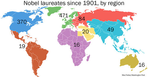
Here is one example. Map #14 in the newer set is entitled "Who wins Nobel prizes (and who doesn't)." It shows the geographical distribution of Nobel Prize winners since 1901.

Discussion
Fisher writes, "Maps can be a remarkably powerful tool for understanding the world and how it works, but they show only what you ask them to." What does the Nobel map show? What other questions occur to you that it does not answer?
Fisher has further discussion of these data in The amazing history of the Nobel Prize, told in maps and charts (15 October 2013).
Submitted by Paul Alper
