Chance News 114: Difference between revisions
| Line 163: | Line 163: | ||
"What's going on in this graph?", a collaboration between the ''New York Times'' and the American Statistical Association, was launched last fall. It is a great resource for getting students to engage in discussion about data graphics. Last year it was a monthly feature (archives available [https://www.nytimes.com/column/whats-going-on-in-this-graph?emc=edit_ln_20171109&nl=learning-network&nlid=52022771&te=1 here]), but it will now appear weekly. | "What's going on in this graph?", a collaboration between the ''New York Times'' and the American Statistical Association, was launched last fall. It is a great resource for getting students to engage in discussion about data graphics. Last year it was a monthly feature (archives available [https://www.nytimes.com/column/whats-going-on-in-this-graph?emc=edit_ln_20171109&nl=learning-network&nlid=52022771&te=1 here]), but it will now appear weekly. | ||
The NYT article contains tips on how to use the materials in class, and testimonials from teachers who used the resource last year. | The NYT article contains tips on how to use the materials in class, and testimonials from teachers who used the resource last year, and the 2018-19 schedule of moderated discussions. The [http://www.amstat.org/ASA/Whats-Going-on-in-this-Graph.aspx ASA page on the project] includes links to related videos, webinars and podcasts. | ||
Revision as of 13:56, 6 September 2018
July 1, 2018 to ...
Quotations
"I have found it intriguing to narrate the history of statistics as viewed from the special lens of its orphaned sister: causation. The story of this 'forbidden love' was never told before and, believe me, it is full of mystery, intrigue, personalities, dogmatic orthodoxy, and heroic champions of truth and conviction."
[Vermont state] Rep. Van Wyck of Ferrisburgh explained his vote as follows: “Madam Speaker: I voted No. In college, I learned there were Lies, Damnable Lies, and then there is Statistics. I am not impressed with a number of these statistics.”
Submitted by Jeanne Albert
"But claiming there is no ‘safe’ level [of alcohol comsumption] does not seem an argument for abstention. There is no safe level of driving, but government do not recommend that people avoid driving. Come to think of it, there is no safe level of living, but nobody would recommend abstention."
Forsooth
“That means then that criminal aliens are committing 28 percent of the crimes in the United States. And so that means 28 percent of the murders, 28 percent of the rapes, 28 percent of the violence and the assaults and battery, first- and second-degree murder and also manslaughter attacks are committed by criminal aliens.”
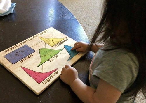
Never too early to start!
Submitted by David Ballard
(Note: It's a real puzzle toy, and apparently sold out!)
How likely is "likely"?
If you say something is “likely,” how likely do people think it is?
by Andrew Mauboussin and Michael J. Mauboussin, Harvard Business Review, 3 July 2018
The everyday language used to describe probabilities is notoriously vague.
Chance of rain
What does a chance of rain in the ABC-7 Day forecast really mean?
by Nichole Gomez, KVIA (El Paso, TX), 1 August 2018
One often heard and commonly misunderstood probability assessment concerns the chance of rain announced in a weather forecast. In the story we read:
"The chance of rain, or probability of precipitation (POP), is based on a mathematical formula that takes the forecaster's confidence into account." That formula is as follows: POP = Coverage x Confidence.
The following interpretation is offered.
These words are also associated with a POP:
10-20% includes "slight chance" and "widely scattered"
30-50% includes "chance" and "scattered"
60-70% includes "likely" and "numerous"
80-100% includes definitive types of precipitation such as rain, snow or showers.
Discussion
1. Do you understand the definition of POP above? Compare the following description of the probability of precipitation from the FAQ page of the National Weather Service::
PoP = C x A where "C" = the confidence that precipitation will occur somewhere in the forecast area, and where "A" = the percent of the area that will receive measureable precipitation, if it occurs at all.
2. What do you make of the verbal interpretations offered?
Counting LA's homeless
More sidewalk tents, but fewer people living in them? The 2018 homeless count's new math
by Dakota Smith and Doug Smith, Los Angeles Times, 15 July 2018
Plastic straws
How a 9-year-old boy’s statistic shaped a debate on straws
by Niraj Chokshi, New York Times, 19 July 19 2018
Milo Cress, a nine-year-old Vermont boy, has launched the Be Straw Free campaign. He estimates that Americans use 500 million plastic straws a day. The figure that has been widely reported in the press, often with praise for Milo's efforts. But what was the source of his estimate? We read
After failing to find reliable statistics online about straw usage, he [Milo] decided to call a handful of manufacturers himself. “The average of those was 500 million,” he said, adding that, being 9, he had not thought to document the process closely. “It’s likely that the number has changed since then, and I would hope that the number has gone down.”
The NYT article includes the following:
Fact check: The claim that 500 million straws are used by Americans is an estimate above the ranges of more rigorous studies. Market research firms put the figure between 170 million and 390 million per day, or 63 billion to 142 billion straws per year.
Discussion
- Five hundred million straws daily is more than one per day on average for everyone living in the US. Do you find this surprising?
- The National Park Service has a web page dedicated to the Be Straw Free Campaign. To put the 500 million straw figure into perspective, they say, "[T]his would fill over 125 school buses with straws every day. That's 46,400 school buses every year!" This is reminiscent of the Guesstimation story discussed in Chance News 49. Does a back of the envelope approach support the result of 125 buses?
Comment on gerrymandering
Emil Friedman observed that Gerrymandering has been a hot topic in recent Chance News (see, for example, posts in CN 111, CN 112, CN 113), and sent the following comment:
Virtually any complex method we devise to combat Gerrymandering can probably be manipulated to partisan advantage. However, a simple way to make partisan gerrymandering nearly or completely impossible would be a nationwide system wherein we divide each state that is wider than it is tall (on a Mercator Projection) by vertical straight lines into contiguous vertical slices having nearly equal populations. States that are taller than wide would be divided horizontally instead of vertically. If adopted nationwide, it would make it impossible to rig the voting districts. However, a big downside is that it -- and almost any other solution involving a nationwide system -- would probably require a constitutional amendment.
Are college exams killing grandma?
For comic relief as we approach the start of a new academic year, Margaret Cibes sent the following two articles:
- The dead grandmother/exam syndrome, by Mike Adams, Annals of Improbable Research, November/December 1999
- A preliminary report on an intervention designed to reduce grandmother death resulting from college exams, by Lee Jussim, April 2002
Jussim cites Adams's original paper, where we read
The basic problem can be stated very simply:
A student’s grandmother is far more likely to die suddenly just before the student takes an exam, than at any other time of year.
The paper includes tongue-in-cheek regressions and wild extrapolations to prove the point. Reproduced below is one of the tables which shows mean family death rate (in deaths per 100 students), broken down by students's current grade and whether an exam (midterm or final) is coming up.
Alzheimer's drug study
Why the latest Alzheimer’s drug study has so many people confused
by Clifton Leaf, Fortune, 30 July 2018
Examines conflicting reports in the popular press concerning a recent Alzheimer's drug study; For example, see the following stories:
- Is this drug the most promising development on Alzheimer's in recent history?, USA Today, 26 July 2018.
- Biogen plummets as Alzheimer drug shows little efficacy in trial, TheStreet, 26 July 2018
Further discussion at HealthNewsReview.org, which asks why the drug generated so much news coverage. The fact that there is no viable treatment at present, and the enormous potential market were both cited as likely contributors.
Workplace wellness programs
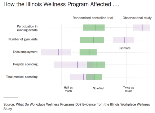
Workplace wellness programs don’t work well. Why some studies show otherwise
by Aaron E. Carroll, New York Times, "TheUpshot" blog, 6 August 2018
Compares results of observational studies with subsequent randomized trials. In a number of cases, the effects found in the earlier studies are seen to disappear. Article includes the following graphic:

At HealthNewsReviews, Gary Schwitzer's post Observations about today’s observational studies in the news identifies three misleading news stories from August 28, 2018.
Alcohol risks
How much alcohol is safe to drink? None, say these researchers
by Nicholas Bakalar, New York Times, 27 August 2018
Study causes splash, but here’s why you should stay calm on alcohol’s risks
by Aaron E. Carroll, New York Times, "TheUpshot" blog, 28 August 2018
The articles refer to a study published in the Lancet , entitled "Alcohol use and burden for 195 countries and territories, 1990–2016: a systematic analysis for the Global Burden of Disease Study 2016." The researchers write
Alcohol use is a leading risk factor for global disease burden and causes substantial health loss. We found that the risk of all-cause mortality, and of cancers specifically, rises with increasing levels of consumption, and the level of consumption that minimises health loss is zero. These results suggest that alcohol control policies might need to be revised worldwide, refocusing on efforts to lower overall population-level consumption.
Moreover, as the first NYT article notes, the study did not find any health benefits from moderate drinking, which runs counter to some previous thinking.
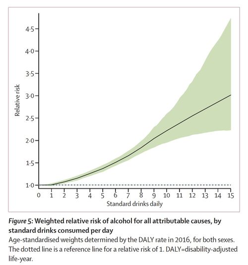
David Spiegelhalter (see Quotations above), was critical of the study's advice for moderate drinkers. In a blog post he reproduced the following graphic from the Lancet.
Notice that the change from 0 to 1 drink per day is barely visible here. Moreover, while the paper focused exclusively on relative risks, Spiegelhalter applauds the Lancet editors for including absolute risks in the press release, which he quotes as follows.
Specifically, comparing no drinks with one drink a day the risk of developing one of the 23 alcohol-related health problems was 0.5% higher — meaning 914 in 100,000 15–95 year olds would develop a condition in one year if they did not drink, but 918 people in 100,000 who drank one alcoholic drink a day would develop an alcohol-related health problem in a year.
This increased to 7% in people who drank two drinks a day (for one year, 977 people in 100,000 who drank two alcoholic drinks a day would develop an alcohol-related health problem) and 37% in people who drank five drinks every day (for one year, 1252 people in 100,000 who drank five alcoholic drinks a day would develop an alcohol-related health problem).
This calculation was also reported in the second NYT article, which noted, "Even at five drinks per day, which most agree is too much, the vast majority of people are unaffected." That article also notes that the study is not a controlled experiment, but rather a large meta-analysis of observational studies. Thus, despite the researchers's best effort, there is no guarantee that all possible confounding variables have been accounted for. The article cites an NCBI study The perils of conducting meta-analyses of observational data, writing
But when we compile observational study on top of observational study, we become more likely to achieve statistical significance without improving clinical significance. In other words, very small differences are real, but that doesn’t mean those differences are critical.
What's going on in this graph?
Thanks to Sharon Hessney for sending this announcement:
- ‘What’s Going On in This Graph?’ is now weekly. STEM teachers explain why it’s a powerful activity
- by Michael Gonchar, New York Times, 27 August 2018
"What's going on in this graph?", a collaboration between the New York Times and the American Statistical Association, was launched last fall. It is a great resource for getting students to engage in discussion about data graphics. Last year it was a monthly feature (archives available here), but it will now appear weekly.
The NYT article contains tips on how to use the materials in class, and testimonials from teachers who used the resource last year, and the 2018-19 schedule of moderated discussions. The ASA page on the project includes links to related videos, webinars and podcasts.


