108: Difference between revisions
| Line 207: | Line 207: | ||
:[http://www.nytimes.com/2016/06/28/upshot/exit-polls-and-why-the-primary-was-not-stolen-from-bernie-sanders.html Exit polls, and why the primary was not stolen from Bernie Sanders]<br> | :[http://www.nytimes.com/2016/06/28/upshot/exit-polls-and-why-the-primary-was-not-stolen-from-bernie-sanders.html Exit polls, and why the primary was not stolen from Bernie Sanders]<br> | ||
:by Nate Cohn, "Upshot" blog, ''New York Times'', 27 June 2016 | :by Nate Cohn, "Upshot" blog, ''New York Times'', 27 June 2016 | ||
<center>[[File:Upshot exitPoll.png | 600px]] </center> | |||
Revision as of 22:06, 11 August 2016
Quotations
"The p-value was never intended to be a substitute for scientific reasoning."
Submitted by Bill Peterson
"If it is good and kind to suggest to people that the odds against their dreams are shorter than they think, then Las Vegas is truly a very good, kind city. But most do not think it so."
.
Suggested by Peter Doyle
Forsooth
"There are 33 percent more such women in their 20s than men. To help us see what a big difference 33 percent is, Birger invites us to imagine a late-night dorm room hangout that’s drawing to an end, and everyone wants to hook up. 'Now imagine,' he writes, that in this dorm room, 'there are three women and two men.'"
Cited in Imagine 33 percent at Jordan Ellenberg's "Quomodocumque" blog (20 November 2015).
Submitted by Priscilla Bremser
“I showed all the data together, which helped disguise the bimodal distribution. Nothing wrong with that. All the data is there. Every piece.... [But then he suggested using] thick and thin lines to try and dress it up, or changing colors to divert attention.”
Quoted in: Takata emails show brash exchanges about data tampering, New York Times, 4 January 2016
Submitted by Bill Peterson

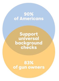
Cited in Hillary Clinton's campaign just released the worst Venn diagram of all time, Vox.com, 21 May 2016.
Suggested by Lucy Nussbaum
Simulating the lottery
Here’s $100. Can you win $1.5 billion at Powerball?
by Jan Schleuss, Los Angeles Times, 8 January 2016 (updated 12 Jan 2016)
By Wednesday January 13 of this year, the Powerball jackpot had reached $1.6 billion, making it the largest lottery jackpot in history. There were three winners that day. This article, published the week before as the prize was still growing, was one of many examples in the popular press intended to inform people how remote the chance of winning (1 in 292,201,338) really was. It includes an online tool that allows the user to select their lucky numbers, and then observe their fate over the course of 50 simulated drawings, which is $100 worth of plays. Here's the message I got after one try. No jackpot, but my minor prizes were automatically invested in more tickets.
You've played the lottery 54 times over about 6 months and spent $108, but won $8. You're in the hole $100. So why not throw some more money at that problem? [The options offered are to bet $100, $1000, or your whole paycheck.]
By contrast, the New York Times tried to explain the hopelessness in prose [1] (NYT, 12 January 2016). The article lists some time-honored comparisons: the 1 in 1.19 million chance that a US resident will be hit by lightning in a year and the 1 in 12,500 chance that an amateur golfer will make a hole-in-one.
For a fresher perspective, see Ron Wasserstein's excellent piece A statistician’s view: What are your chances of winning the Powerball lottery? (this originally appeared in the Huffington Post on 16 May 2013, and was updated 7 January 2016). Wasserstein calculates that if you took a dollar bill for each possible combination and laid them end to end, you could make a generous roundtrip tour from the east coast to the west coast--- and traverse it twice. Now he asks us to imagine trying to pick just one lucky dollar bill from the trip!
Followup
More than half of Powerball tickets sold this time will be duplicates
by Matt Rocheleau, Boston Globe, 13 January 2016.
This article appeared on the morning of the drawing. It noted that roughly 440 million tickets had been sold the previous Saturday. This is more than enough to cover all 292 million possible number combinations. However, according to lottery officials, only about 227 million of these combinations had actually been played, representing only 77.8% of the total.
The Globe solicited input from a number of professional statisticians to explain this phenomenon. Professor Timothy Norfolk of the University of Akron pointed out that people often play birthdays and other "lucky numbers" rather that choosing numbers at random, and tend to avoid certain patterns. Of course, many other players opt for machine-generated quick-picks. But even random selections would not be expected to cover all possible combinations. Norfolk added, “For example, if you roll a dice six times, you’re fairly unlikely to see it roll a different number each of the six times.”
The Globe avoided presenting any further calculations, but the required formulas are familiar from probability theory. In r independent rolls of a fair n-sided die, the probability that a particular face appears at least once is {1 - [(n - 1)/n]^r }, so the expected number of different faces that appear is given by
n * {1 - [(n - 1)/n]^r }
Taking n = 6 and r = 6 we see that in 6 rolls of an ordinary die, the expected number of different faces to appear is 6*(11/36) = 3.99, which is about 2/3 of the total possible. For the lottery example, taking n = 440 million and r = 292.2 million gives 227.4 million expected combinations, which is strikingly close to what was observed!
Submitted by Bill Peterson
Middle-age white mortality
Contemplating American mortality, again
The Economist, Daily Chart, 29 January 2016
In a 2015 PNAS article Rising morbidity and mortality in midlife among white non-Hispanic Americans in the 21st century, Princeton economists Anne Case and Angus Deaton presented surprising conclusions from recent mortality trends. From their abstract:
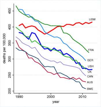
This paper documents a marked increase in the all-cause mortality of middle-aged white non-Hispanic men and women in the United States between 1999 and 2013. This change reversed decades of progress in mortality and was unique to the United States; no other rich country saw a similar turnaround. The midlife mortality reversal was confined to white non-Hispanics; black non-Hispanics and Hispanics at midlife, and those aged 65 and above in every racial and ethnic group, continued to see mortality rates fall. This increase for whites was largely accounted for by increasing death rates from drug and alcohol poisonings, suicide, and chronic liver diseases and cirrhosis.
Their Figure 1, which is reproduced below, illustrates how starkly the US experience differs from seven other industrialized nations.

The findings drew wide media attention. Deaton was quoted in the New York Times (15 November 2015) “Only H.I.V./AIDS in contemporary times has done anything like this.” Many other commentators weighed in with possible explanations for the trend. For example, in a NYT op/ed Why are white death rates rising? (22 February 2016) Andrew Cherlin of Johns Hopkins University invoked “reference group theory,” which in simple terms reflects the basic data analysis question, "Compared to what?" Cherlin argues that working class whites have experienced declining fortunes relative to their parents; thus, even though they still fare better than blacks and Hispanics, white workers as a group tend to be more pessimistic.
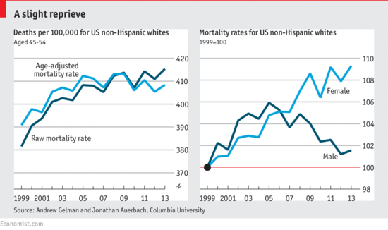
Back in the fall, however, discussion on Andrew Gelmans’s blog was already raising the issue that aggregation bias might have affected the mortality analysis. During the period studied, 1999-2013, the peak of the baby boom generation was passing through the middle age. Thus the average age in the 45-54 year age window was older at the end of the period than at the beginning, which would bias the estimate of middle-age mortality upwards. Gelman presents some quick calculations with census data to support this idea.
A more detailed demonstration is given analysis in Gelman's paper with Jonathan Auerbach, Age-aggregation bias in mortality trends, which was the basis for a note to PNAS. In addition to the age effect, they found that “Calculating the age-adjusted rates separately for each sex reveals a crucial result.... The mortality rate among white non-Hispanic American women increased from 1999–2013. Among the corresponding group of men, however, the mortality rate increase from 1999–2005 is nearly reversed during 2005–2013.”
Gelman's findings were the basis of the “Contemplating American mortality, again” chart from the Economist:

For more discussion, see Gelman’s blog post Middle-aged white death trends update: It’s all about women in the south (January 19, 2016).
In short, the original Case and Deaton findings pointed to interesting further inquiries. The Washington Post cites the ongoing research in their own investigation A new divide in American deaths (10 April 2016). Their interactive graphics allow readers to compare urban and rural death rates by ethnicity (white, black, Hispanic), sex and age.
Submitted by Bill Peterson
Ice cream and IQ
Daily Chart: Ice Cream and IQ
The Economist, 1 April 2016
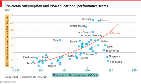
The chart (reproduced below) shows per capita ice cream consumption for a sample of countries plotted against mean PISA (Programme for International Student Assessment) reading scores. A positive association (R^2 = 0.49) is revealed.

But note the date! From the comments section, you can see that not everyone immediately recognized the joke. However, several readers did point out that both variables are plausibly responses to income.
ASA issues statement on p-values
The ASA's statement on p-values: Context, process, and purpose
by Ronald L. Wasserstein and Nicole A. Lazar, The American Statistician, 70:2 (2016).
The report, based on contributions from 26 experts, enunciates six main principles, with discussion of each. The principles are reproduced below.
- P-values can indicate how incompatible the data are with a specified statistical model.
- P-values do not measure the probability that the studied hypothesis is true, or the probability that the data were produced by random chance alone.
- Scientific conclusions and business or policy decisions should not be based only onwhether a p-value passes a specific threshold.
- Proper inference requires full reporting and transparency.
- A p-value, or statistical significance, does not measure the size of an effect or the importance of a result.
- By itself, a p-value does not provide a good measure of evidence regarding a model or hypothesis.
Violations of the second principle are common in the popular press (and even appear in published research papers), and are often presented in the Forsooth section this wiki (here is one from Chance News 105).
Even explaining the issue can be tricky. When Nature News reported that the journal Basic and Applied Social Psychology would no longer publish papers presenting P-values, they had to issue the following correction:
Clarified: This story originally asserted that “The closer to zero the P value gets, the greater the chance the null hypothesis is false.” P values do not give the probability that a null hypothesis is false, they give the probability of obtaining data at least as extreme as those observed, if the null hypothesis was true. It is by convention that smaller P values are interpreted as stronger evidence that the null hypothesis is false. The text has been changed to reflect this.
A FiveThirtyEight blogpost provided numerous examples suggesting that Not even scientists can easily explain P-values.
In another post, FiveThirtyEight provided interactive demonstration of P-value hacking, entitled Hack Your Way To Scientific Glory. A scatterplot shows the strength of the economy vs. the degree of political power of your preferred party (choose Democrat or Republican). Your mission is to show that having your party "in control" of the government helps "the economy" by tweaking how the variables are defined.
Reproducibility crisis in psychology. Andrew Gelman, No, this post is not 30 days early: Psychological Science backs away from null hypothesis significance testing
John Oliver on scientific studies
Margaret Cibes sent a link to the following:
- John Oliver’s rant about science reporting should be taken seriously
- by John Timmer, arstechnica.com, 10 May 2016
https://www.youtube.com/watch?v=0Rnq1NpHdmw
spurious nutritional correlations from FiveThirtyEight.
We can also count on XKCD to pick up on such controversy: see Trouble for science.
Predicting recidivism
Machine bias: There’s software used across the country to predict future criminals. And it’s biased against blacks.
by Julia Angwin, Jeff Larson, Surya Mattu and Lauren Kirchner, ProPublica, 23 May 2016
On the Isolated Statisticians list, Jo Hardin cited Episode 17 of the Not so standard deviations podcast, by Hilary Parker and Roger Peng. It includes discussion of the above study (note: the link to ProPublica from the podcast page appears to be broken, but the one at the head of this post is correct).
In making parole decisions, prison officials seek to predict whether the degree to which they still pose a threat. The article finds racial bias in the statistically-based algorithms used to make such predictions. As
We obtained the risk scores assigned to more than 7,000 people arrested in Broward County, Florida, in 2013 and 2014 and checked to see how many were charged with new crimes over the next two years, the same benchmark used by the creators of the algorithm [identified as a for-profit company called Northpointe].
Reproduced below is a summary table that breaks out recidivism rates by risk assessment and race.
| White | African American | |
|---|---|---|
| Labeled higher risk, but didn't re-offend | 23.5% | 44.9% |
| Labeled lower risk, yet did re-offend | 47.7% | 28.0% |
Among those predicted to be at higher risk, blacks re-offended at lower rates than whites; among those predicted to be at lower risk, whites reoffended at higher rates. The authors provide links to their full analysis and have posted their data on GitHub.
The article reports that at least nine states provide some form of risk assessment scores to judges for consideration in sentencing. In Pennsylvania wants to use science In criminal sentencing, the Huffington Post (11 August 2015) described that state's plans to use expand the use of algorithms beyond parole and bail applications to the actual sentencing guideline. It links to a FiveThirtyEight analysis, Should prison sentences be based on crimes that haven’t been committed yet?. ( Both note the eerie resemblence to the sci-fi film Minority Report.)
Underdogs are overrated
Peter Doyle sent a link to the following:
Underdogs are overrated: Leicester City’s success should be celebrated, but not sentimentalised
The Economist, 7 May 2016
Leicester City's football (soccer) team was a 5000-to-1 long shot when it captured the English Premier League championship on May 7. While everyone loves the story of the plucky underdog, the cases where the underdog loses naturally get much less attention. The article wonders if this leads us "to set too little store by one of the greatest achievements of civilisation: predictability."
The (very quotable) article concludes:
Making the world more predictable allows people to put more into it and get more out of it. This is the great work of civilisation, from explanations of nature through science to expectations that justice will be delivered through the law. A probabilistic nihilism that delights in the unexpected in and of itself sets at naught such achievements.
Exit polls
Margaret Cibes sent a link to the following:
- How exit polls work, explained
- by Philip Bump, Washington Post, 22 April 2016
In an unexpectedly strong showing, Hillary Clinton defeated Bernie Sanders in the New York Democratic Primary 58% to 42%. Adding to the disappointment of Sanders supporters was the fact that exit polling on election day had suggested a much closer race, with Clinton leading by about 4 percentage points.
The Post article summarizes an interview with Joe Lenski of Edison Media Research, which conducts exit polling for a group that includes Fox, CNN, ABC, CBS, NBC and the AP. According to Lenski,
[t]here are two important uses of the exit poll. One is to project a winner. But the main use of the exit poll that night and historically is to have the most accurate representation of the demographics of voters. How each demographic voted, what the issues were, when people decided how to vote. To make those demographic results as accurate as possible, we want to match to the actual results by precinct, by region of the state, etc.
He explains how these adjustments are made continously during the day, as the organization gains more information about turnout among different demographic subgroups. These adjustments, which went against Sanders, were especially vexing to his supporters, and gave rise to a number of theories about how the election was fixed. (See, for example, We need to fix our broken election system, by Tim Robbins in the Huffington Post, 5 May 2016).
As the primary season progressed, the idea that Clinton had somehow stolen the nomination from Sanders persisted. The following blog post attempted to respond.
- Exit polls, and why the primary was not stolen from Bernie Sanders
- by Nate Cohn, "Upshot" blog, New York Times, 27 June 2016
