Chance News 112: Difference between revisions
| Line 77: | Line 77: | ||
*What’s going on in this graph? | *What’s going on in this graph? | ||
They are also invited to participate in an online discussion facilitated by the ASA. | They are also invited to participate in an online discussion facilitated by the ASA. | ||
On a related note, the US Geological Survey's data visualization group has produced an animated graph entitled [https://owi.usgs.gov/vizlab/hurricane-harvey/ Hurricane Harvey's Water Footprint] | |||
Revision as of 12:36, 20 September 2017
Under construction: August 21, 2017 to ...
Quotations
Forsooth
"Of the 36 applicants that were interviewed, 20 were ultimately promoted... . Among the promoted individuals, 62 percent were female and 38 percent were male."
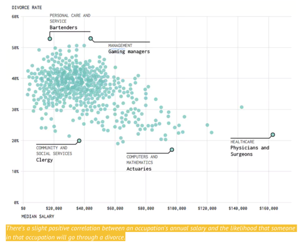
The graphic below appears in: New study reveals bartenders, casino workers most likely to get divorced, Inverse Culture, 5 September 2017
(Note: The scatterplot was originally created by FlowingData, where the relationship is correctly
described as "downward slopey"; the caption above is from the Inverse Culture article.)
Facebook advertises that it "can reach 41 million 18 to 24-year-olds in the United States and 60 million 25- to 34-year-olds." But according to the U.S. Census, there are only 31 million and 45 million total people in those two demographic groups. Details are in this new York Times article.
Lecture on football probability
Margaret Cibes sent a link to the following YouTube video:
It features John Urschel, an offensive for the NFL's Baltimore Ravens, who is also studying applied mathematics at MIT. The video begins with John at a chalkboard using a decision tree to analyze a one-point vs. two-point conversion late in a football game.
John is already a published mathematician, as described in this 2016 article from the Notices of the AMS.
Redefining statistical significance
Scholars take aim at false positives in research
by Thomas Gaulkin, UChicagoNews, 1 September 2017
University Chicago economist John List is one of 72 collaborators whose commentary, Redfine statistical significance, was just published in Nature Human Behavior. The subtitle reads, "We propose to change the default P-value threshold for statistical significance from 0.05 to 0.005 for claims of new discoveries."
To be continued...
How bad/good were the predictions about Hurricane Irma
Irma Shifting Forecast: It's All a Matter of Probability.
by John Schwartz, The New York Times, September 10, 2017.
How surprising is it that Irma is heading up the "wrong" coast of Florida? Well, it changed the plans of one expert.
Brian McNoldy, a researcher at the University of Miama and respected blogger on tropical storms and hurricanes, decided on Thursday to evacuate from South Florida with friends and his two dogs and drive to the Tampa area.
Dr. McNoldy ended up travelling back to Miami once the forecast changed, showing Irma smashing into the west coast of Florida rather than hitting Miami dead on.
Was this a failure of the statistical model? Florida is such a skinny state that Dr. McNoldy admits that predicting where any hurricane will hit is problematic.
"A hundred miles is the difference between the east coast and the west coast-but a hundred miles in a three-day forecast is really good."
More accurate forecasts are unlikely to come anytime soon. The problem is that people don't understand the depiction of uncertainty in the graphic models. The focus is on the line that runs down the middle and they ignore the variation about that line, the cone of probability.
J. Marchall Shepherd, an atmospheric scientist at the University of Georgia exlained the fallacy in a Facebook post. "Anywhere in that cone is a possibility," Dr. Shepherd wrote, "and it has always been a challenge communicating what the cone 'means' versus what people 'think" it means."
Questions
1. There are different maps of the predicted paths of Irma at https://www.nytimes.com/interactive/2017/09/05/us/hurricane-irma-map.html. One shows a cone of probability and another shows 52 separate predictions of the hurricane's path. Which one better depicts the uncertainty of the prediction?
2. Dr. Shepherd mentions in a Facebook post referenced b yhe New York Times article that people often confuse the concept of "percent probability of rain." What are some of the potential misinterpretations of this phrase?
3. Hurricane Harvey reintroduced us to the term "500 year flood." What are some of the potential misinterpretations of this phrase.
What's going on in this graph?
Announcing a new monthly feature: What’s going on in this graph?
by Michael Gonchar and Katherine Schulten, New York Times, 6 September 2017
This article announces a new feature on data visualization with a view towards enriching classroom discussions of statistics. The project is a partnership with the American Statistical Association. The article says:
Teachers tell us these data visualizations are rich texts for classrooms across the curriculum, not just in the math or statistics class. Whether in a literature class analyzing Jane Austen’s language, a science class considering climate data, or a civics class studying gerrymandering, teaching students how to read, interpret and question graphs, maps and charts is a key 21st-century skill.
The inaugural post appeared on September 19 and features a rainfall map that was featured in coverage of Hurrican Harvey. Students are asked to consider the following questions
- What do you notice?
- What do you wonder?
- What’s going on in this graph?
They are also invited to participate in an online discussion facilitated by the ASA.
On a related note, the US Geological Survey's data visualization group has produced an animated graph entitled Hurricane Harvey's Water Footprint
