Chance News 99: Difference between revisions
| (44 intermediate revisions by 2 users not shown) | |||
| Line 1: | Line 1: | ||
April 6, 2014 to June 5, 2014 | |||
==Quotations== | ==Quotations== | ||
"[Penn psychologist [https://psychology.sas.upenn.edu/node/20543 Philip Tetlock]] found that, though a given expert might foretell one extreme event, doing so consistently was next to impossible. …. Tetlock found that experts who claimed to be more certain were more in demand in the media, even though they were less likely to be correct. A study of financial advisers found that those who claimed they knew what stocks were going to do were seen as more credible than those who expressed uncertainty …." | "[Penn psychologist [https://psychology.sas.upenn.edu/node/20543 Philip Tetlock]] found that, though a given expert might foretell one extreme event, doing so consistently was next to impossible. …. Tetlock found that experts who claimed to be more certain were more in demand in the media, even though they were less likely to be correct. A study of financial advisers found that those who claimed they knew what stocks were going to do were seen as more credible than those who expressed uncertainty …." | ||
<div align=right>James Surowiecki in "Punditonomics"<br> | <div align=right>-- James Surowiecki, in: "Punditonomics"<br> | ||
<i>The New Yorker</i>, April 7, 2014</div> | <i>The New Yorker</i>, April 7, 2014</div> | ||
See a review of Tetlock's 2005 book [http://press.princeton.edu/titles/7959.html <i>Expert Political Judgment: How Good Is It? How Can We Know?</i>] in [http://test.causeweb.org/wiki/chance/index.php/Chance_News_10 Chance News 10].<br> | See a review of Tetlock's 2005 book [http://press.princeton.edu/titles/7959.html <i>Expert Political Judgment: How Good Is It? How Can We Know?</i>] in [http://test.causeweb.org/wiki/chance/index.php/Chance_News_10 Chance News 10].<br> | ||
See also [http://www.theatlantic.com/features/archive/2014/04/the-confidence-gap/359815/ "The Confidence Gap"], by Katty Kay and Claire Shipman, <i>The Atlantic</i>, April 14, 2014, for descriptions of some experiments comparing confidence levels of men vs. those of women, especially where <i>competence</i> levels were comparable. | |||
Submitted by Margaret Cibes | Submitted by Margaret Cibes | ||
---- | ---- | ||
"When researchers with the Third International Mathematics and Science Study (TIMSS) compared math curricula and textbooks across participating countries, they found two areas in which American math education is a world leader: We cover far more topics than most other countries do and we have fatter text books. As far as we can tell, the only Americans who benefit from this situation are the owners of paper mills." | |||
<div align=right> -- Derrick Niederman and David Boyum, ''What the Numbers Say'' (p. 239) </div> | |||
Submitted by Paul Alper | |||
---- | |||
"At the same time, the company [Roche] was raising the broken arguments that are eerily familiar to anyone who has followed the campaign for greater trials transparency. Key among these was one that cuts to the core of the culture war between evidence-based medicine, and the older 'eminence-based medicine' that we are supposed to have left behind. It is simply not the job of academics to make these decisions about benefit and risk, said Roche, it is the job of regulators." | |||
<div align=right> -- Ben Goldacre, in: [http://www.theguardian.com/business/2014/apr/10/tamiflu-saga-drug-trials-big-pharma What the Tamiflu saga tells us about drug trials and big pharma], ''The Guardian'', 9 April 2014</div> | |||
Submitted by Paul Alper | |||
---- | |||
“If you look at a graph and say, 'Boy, is that a great graph!' it isn’t. The appropriate response for a great graph is, 'My God, what interesting data!' Or more specifically, some emotion associated with the phenomenon, because what we’re really talking about is a graph that exposes the phenomenon.” | |||
<div align=right>-- Howard Wainer, in the Chance video [http://www.dartmouth.edu/~chance/ChanceLecture/graph/graph.htm | |||
“How to Display Data Badly”], 1990s</div> | |||
Submitted by Margaret Cibes | |||
---- | |||
The Affordable Care Act is its own sweeping experiment, as only about half the states expanded Medicaid. | |||
“It’s very unfortunate for people living in states not expanding Medicaid," said Richard Kronick, a health policy official at the Department of Health and Human Services, “but from the point of view of research, it’s a gold mine.” | |||
<div align=right>in: [http://www.nytimes.com/2014/05/06/health/death-rate-fell-in-massachusetts-after-health-care-overhaul.html?hp Mortality drop seen to follow ’06 health law], | |||
by Sabrina Tavernise, ''New York Times'', 5 May 2014</div> | |||
Submitted by Paul Alper | |||
---- | |||
"For each breathless headline between now and Election Day, realize that no single economic statistic will much change the broader context within which the upcoming midterm elections will be fought. The economy changes slowly, even if our economic numbers jump around a lot." | |||
<div align=right>-- Justin Wolfers, in: [http://www.nytimes.com/2014/05/30/upshot/with-gdp-its-important-to-distinguish-signal-from-noise.html Deceptive dip in G.D.P. points to perils of election forecasting], Upshot blog, ''New York Times'', 29 May 2014</div> | |||
Submitted by Bill Peterson | |||
==Forsooth== | ==Forsooth== | ||
| Line 59: | Line 93: | ||
---- | ---- | ||
From testimony by Michael Gove, British Secretary of State for Education before their Education Committee:<br> | From testimony by Michael Gove, British Secretary of State for Education, before their Education Committee:<br> | ||
"Q98 Chair: | "Q98 Chair: [I]f 'good' requires pupil performance to exceed the national average, and if all schools must be good, how is this mathematically possible?<br> | ||
"Michael Gove: By getting better all the time.<br> | "Michael Gove: By getting better all the time.<br> | ||
| Line 71: | Line 105: | ||
"Q100 Chair: Were you better at literacy than numeracy, Secretary of State?<br> | "Q100 Chair: Were you better at literacy than numeracy, Secretary of State?<br> | ||
"Michael Gove: I cannot remember." | "Michael Gove: I cannot remember." | ||
<div align=right>[http://www.publications.parliament.uk/pa/cm201012/cmselect/cmeduc/uc1786-i/uc178601.htm Oral Evidence], British House of Commons, January 31, 2012</div> | <div align=right>[http://www.publications.parliament.uk/pa/cm201012/cmselect/cmeduc/uc1786-i/uc178601.htm Oral Evidence], British House of Commons, January 31, 2012, p. 28</div> | ||
Submitted by Margaret Cibes | |||
---- | |||
"So, all you've gotta do is set up a null hypothesis and try and prove it. | |||
And when you can't prove it, well that means your original hypothesis must be true. …. You said you believe Cassius returns to the scene of the crimes. And you've got photos of every murder. So set up a hypothesis of, say, Stephen Hawking is Cassius... which gives you a null hypothesis of Stephen Hawking is not Cassius. So, go through the photos and try and prove the null... that Rolling Thunder is not Cassius. If you can, that means your hypothesis is incorrect. If you can't... then depending on your 'P' value of course... you've statistically proven your hypothesis must be true. Or that Stephen Hawking is Cassius. Yeah. Some of us didn't sleep our way through Logic and Stats at Harvard."<br> | |||
<div align=right>[http://www.springfieldspringfield.co.uk/movie_script.php?movie=double-the <i>Doubt, The Movie Script</i>], 2011</div> | |||
Submitted by Margaret Cibes | Submitted by Margaret Cibes | ||
| Line 192: | Line 232: | ||
3. In addition to the p-values in Table 2 and Table 3, Table 4 has lots of p-values, most of which are less than the magical .05. If a p-value less than .05 is noteworthy, why is this collection of p-values less impressive? | 3. In addition to the p-values in Table 2 and Table 3, Table 4 has lots of p-values, most of which are less than the magical .05. If a p-value less than .05 is noteworthy, why is this collection of p-values less impressive? | ||
<center>[[File:IndrioTable4.png | 550px]]</center> | |||
4. Note that if you were to do a search for the probiotic used in both of the studies discussed,“lactobacillus reuteri dsm 17938,” which is made by a Swedish company, BioGaia, you will find many positive hits. On [http://en.wikipedia.org/wiki/BioGaia the Wikipedia BioGaia page] itself we find this cautionary note: | 4. Note that if you were to do a search for the probiotic used in both of the studies discussed,“lactobacillus reuteri dsm 17938,” which is made by a Swedish company, BioGaia, you will find many positive hits. On [http://en.wikipedia.org/wiki/BioGaia the Wikipedia BioGaia page] itself we find this cautionary note: | ||
"The neutrality of this article is disputed. Relevant discussion may be found on the talk page. Please do not remove this message until the dispute is resolved. (March, 2013)" | "The neutrality of this article is disputed. Relevant discussion may be found on the talk page. Please do not remove this message until the dispute is resolved. (March, 2013)" | ||
5. There is an [http://www.bmj.com/content/348/bmj.g2286 accompanying editorial] | 5. There is an [http://www.bmj.com/content/348/bmj.g2286 accompanying editorial] by Bennett to Sung’s article. Bennett says | ||
<blockquote> | <blockquote> | ||
Infant colic is a challenging problem for many parents, but the | Infant colic is a challenging problem for many parents, but the | ||
| Line 222: | Line 263: | ||
6. A sample of size one is not impressive statistically. Nonetheless, be sure to ask your parents whether or not you were a “fussy” baby. If you weren’t, ask them what they did to prevent colic. If you were, ask them what they did to treat you. | 6. A sample of size one is not impressive statistically. Nonetheless, be sure to ask your parents whether or not you were a “fussy” baby. If you weren’t, ask them what they did to prevent colic. If you were, ask them what they did to treat you. | ||
Submitted by Paul Alper | |||
==Big data surprises== | |||
[http://online.wsj.com/news/articles/SB10001424052702303369904579423132072969654 Big data uncovers some weird correlations]<br> | |||
by By Deborah Gage , ''Wall Street Journal'', 23 March 2014 | |||
The article is subtitled "There's a Link Between Sales and Phases of the Moon, Among Other Things." It includes the following graphic, which could qualify as a Forsooth! | |||
<center>[[File:MoonMetrics.jpg | 400px]]</center> | |||
Here is another example: | |||
<blockquote> | |||
The online lender ZestFinance Inc. found that people who fill out their loan applications using all capital letters default more often than people who use all lowercase letters, and more often still than people who use uppercase and lowercase letters correctly. | |||
<br><br> | |||
ZestFinance Chief Executive Douglas Merrill says the company looks at tens of thousands of signals when making a loan, and it doesn't consider the capital-letter factor as significant as some other factors—such as income when linked with expenses and the local cost of living. | |||
<br><br> | |||
So while it may take capital letters into consideration when evaluating an application, it hasn't held a loan up because of it. | |||
</blockquote> | |||
Submitted by Paul Alper | |||
==Paintings by the numbers== | |||
Bob Griffin sent a link to: | |||
[http://fivethirtyeight.com/features/a-statistical-analysis-of-the-work-of-bob-ross/ A statistical analysis of the work of Bob Ross]<br> | |||
by Walt Hickey, FiveThirtyEightLife blog, 14 April 2014 | |||
Ross was painter on the PBS series, “The Joy of Painting." He starred in 403 episodes that originally aired from 1983-1994, and are still showing in reruns. | |||
The blog post give the following graphic showing how often various elements appeared in Ross's pairings. | |||
: [[File:Hickey-ross.png | 389px]] | |||
The data are [https://github.com/fivethirtyeight/data/tree/master/bob-ross available on GitHub]. Some analyses performed by FiveThirtyEight readers can be found in the update, [http://fivethirtyeight.com/datalab/happy-bob-ross-visualizations/ Happy Bob Ross visualizations]. (21 April 2014). | |||
==Variability in employment figures== | |||
[http://www.nytimes.com/2014/05/02/upshot/how-not-to-be-misled-by-the-jobs-report.html?hp&target=comments#commentsContainer How not to be misled by the jobs report]<br> | |||
by Neil Irwin, New York Times, Upshot blog, 1 May 2014 | |||
Much attention is paid to the Commerce Departments monthly report of the number of jobs added or lost by the US economy. But only rarely do reports in the popular press highlight the fact | |||
that these figures are based on survey data, and hence subject to sampling variability. | |||
Irwin's post here includes an animated simulation (screen captures shown below) that indicates what 12 months of sample data might look like based on various assumptions about what the economy is really doing. | |||
:[[File:JobReportSim.png | 450px]] [[File:JobReportSim2.png | 450px]] | |||
See [http://test.causeweb.org/wiki/chance/index.php/Chance_News_88#Is_someone_cooking_the_unemployment_numbers.3F Is someone cooking the unemployment numbers?] in Chance News 88 for discussion surrounding a good jobs report that appeared just prior to the 2012 presidential election. Catherine Rampell wrote in the ''NYT'' at that time, "These numbers are always tremendously volatile, but the reasons are statistical, not political." | |||
Submitted by Bill Peterson | |||
==A spurious correlation a day!== | |||
[http://www.tylervigen.com Spurious correlations]<br> | |||
tylervigen.com | |||
Paul Alper sent a link to this site, which was referenced on the Rachel Maddow show. It is updated daily with a pair of time series plots, with the axis scales adjusted to suggest a correlation. For example, this one [http://www.tylervigen.com/view_correlation?id=558] on beekeeping and marriage rates in Vermont. | |||
<center>[[File:Honey-producing-bee-colonies-us_marriage-rate-in-vermont.png]]</center> | |||
==Confusion about odds== | |||
[http://afterdeadline.blogs.nytimes.com/2014/05/13/when-spell-check-cant-help-22/ When spell-check can’t help]<br> | |||
By Philip B. Corbett, "After Deadline" blog, ''New York Times'', 13 May 2014 | |||
The After Deadline blog presents stylistic advice for journalists using examples from recent news stories. The present installment includes warnings about vague statements involving odds. Consider these two examples: | |||
*The odds of Mr. Gandhi’s becoming the next prime minister have dropped so low that Mumbai bookies have stopped taking bets on him. | |||
*[Headline] Iraq Unrest Narrows Odds for Maliki to Keep Seat | |||
Corbett writes: | |||
<blockquote>Take care to be clear in referring to “odds.” “Higher” odds could suggest that something is more likely (higher probability) or less likely (1,000 to 1, say, compared with 10 to 1). It was difficult to tell whether “narrows odds” in the second headline meant he had more chance or less. Consider “probability,” “likelihood” or “chance” as alternatives if “odds” might be ambiguous.</blockquote> | |||
On a related note Paul Alper shared the following quotations from | |||
''What the Numbers Say: A Field Guide to Mastering Our Numerical World'' by Derrick Niederman and David Boyum (p. 174): | |||
* "If Congress ever decided to act in the public interest, it could do no worse than to pass a law banning the use of odds as a method for stating probabilities." | |||
*"If you're confused [about odds], don't worry, for even if you understand how odds work, you can never be sure if the person you're talking to does." | |||
Submitted by Bill Peterson | |||
==Politics and porn (What's the matter with Kansas?)== | |||
[https://source.opennews.org/en-US/learning/distrust-your-data/ Distrust your data]<br> | |||
by Jacob Harris, opennews.org, 22 May 2014 | |||
Harris identifies 6 ways to make mistakes in reporting data: | |||
*Sloppy proxies | |||
*Dichotomizing | |||
*Correlation does not equal causation | |||
*Ecological inference | |||
*Geocoding | |||
*Data naivete | |||
His prime example, which has of these errors, is a story that was widely circulated via social media. It features the following scatterplot | |||
<center>[[File:Porn_politics.png | 500px]]</center> | |||
Kansas is a clear outlier. Harris credits a reader of Andrew Sullivan's blog for the following explanation of the geocoding problem: | |||
<blockquote> | |||
What happened here was that a large percentage of IP addresses could not be resolved to an address any more specific than “USA.” When that address was geocoded, it returned a point in the centroid of the continental United States, which placed it in the state of—you guessed it—Kansas! | |||
</blockquote> | |||
Kansas aside, the red/blue divide still appears striking, until you realize that it simply amounts to drawing a line at 50% ("dichotomizing.") | |||
The "ecological fallacy" here--state-wide averages for viewing do not tell us which groups are responsible--is similar to Durkheim's (see Chance News 92 [http://test.causeweb.org/wiki/chance/index.php/Chance_News_92#Simpson.E2.80.99s_paradox_and_the_ecological_fallacy here] for more discussion), where he noted that the more Protestant the Prussian province, the larger the suicide rate--but it turns out that the suicides were actually committed by Catholics, not Protestants. The possible analogy here: in Democratic states it may be the Republicans who are frequenting pornography web sites. | |||
On [http://www.mischiefsoffaction.com/2014/04/are-democrats-pervs-some-problems-with.html this web site] we find a view with the axes reversed | |||
<center>[[File:Porn2012vote.png|450px]]</center> | |||
This "reverse causality" has porn viewing "causing" the Obama vote whereas the original has Obama vote "causing" porn viewing. Instead of the loaded term, "causing," this web site tongue-in-cheek says | |||
<blockquote> | |||
Porn pageviews explain 16 percent of the variance in state level presidential vote shares. Each per capita pageview is associated with a two-tenths of a percentage point increase in a state's Democratic vote share, and this is statistically significant at the p≤.01 level. | |||
</blockquote> | |||
[http://andrewgelman.com/2014/05/24/buzzfeed-porn-kansas-results-cant-good/ More commentary] about all this can be found on Andrew Gelman's blog. | |||
Submitted by Paul Alper | Submitted by Paul Alper | ||
Latest revision as of 21:36, 12 June 2014
April 6, 2014 to June 5, 2014
Quotations
"[Penn psychologist Philip Tetlock] found that, though a given expert might foretell one extreme event, doing so consistently was next to impossible. …. Tetlock found that experts who claimed to be more certain were more in demand in the media, even though they were less likely to be correct. A study of financial advisers found that those who claimed they knew what stocks were going to do were seen as more credible than those who expressed uncertainty …."
The New Yorker, April 7, 2014
See a review of Tetlock's 2005 book Expert Political Judgment: How Good Is It? How Can We Know? in Chance News 10.
See also "The Confidence Gap", by Katty Kay and Claire Shipman, The Atlantic, April 14, 2014, for descriptions of some experiments comparing confidence levels of men vs. those of women, especially where competence levels were comparable.
Submitted by Margaret Cibes
"When researchers with the Third International Mathematics and Science Study (TIMSS) compared math curricula and textbooks across participating countries, they found two areas in which American math education is a world leader: We cover far more topics than most other countries do and we have fatter text books. As far as we can tell, the only Americans who benefit from this situation are the owners of paper mills."
Submitted by Paul Alper
"At the same time, the company [Roche] was raising the broken arguments that are eerily familiar to anyone who has followed the campaign for greater trials transparency. Key among these was one that cuts to the core of the culture war between evidence-based medicine, and the older 'eminence-based medicine' that we are supposed to have left behind. It is simply not the job of academics to make these decisions about benefit and risk, said Roche, it is the job of regulators."
Submitted by Paul Alper
“If you look at a graph and say, 'Boy, is that a great graph!' it isn’t. The appropriate response for a great graph is, 'My God, what interesting data!' Or more specifically, some emotion associated with the phenomenon, because what we’re really talking about is a graph that exposes the phenomenon.”
Submitted by Margaret Cibes
The Affordable Care Act is its own sweeping experiment, as only about half the states expanded Medicaid.
“It’s very unfortunate for people living in states not expanding Medicaid," said Richard Kronick, a health policy official at the Department of Health and Human Services, “but from the point of view of research, it’s a gold mine.”
Submitted by Paul Alper
"For each breathless headline between now and Election Day, realize that no single economic statistic will much change the broader context within which the upcoming midterm elections will be fought. The economy changes slowly, even if our economic numbers jump around a lot."
Submitted by Bill Peterson
Forsooth
Here is a genuine Forsooth:
- "...a [Brazilian] government research agency said recently that 65% of respondents to a national survey agreed that women showing too much of their bodies deserve to be attacked.
- "On Friday, the Institute for Applied Economic Research said it was mistaken and that the true number was actually 26%."
Submitted by Paul Alper
More details on the corrections can be found here. We read that the finding "was originally represented by a graphic that showed that 42.7 percent of 3,810 respondents agreed with [the statement], 22.4 percent agreed partially, 8.4 percent partially disagreed and 24 percent totally disagreed. The true values, according to IPEA, should have been 13.2 percent strongly agreed with the statement, 12.8 percent partially agreed, 11.6 partially disagreed, 58.4 percent totally disagreed and 3.4 percent remained neutral."
MedPage TODAY said that “CDC says rates of teen pregnancy have been on the decline over the past 20 years, but that more than one in four teens ages 15 to 17 are still having babies.” If you think that that "one in four teens..." sounds unbelievable, you are correct. The actual CDS statement was “More than 1 in 4 teens who gave birth [emphasis added] were ages 15 to 17....”
A recent article by Stella Dudzic in Significance magazine deals with an analogous situation and mentions developing a curriculum to help people “look at information like this which they encounter in the news, on the internet or while reading a book or report and think about whether it is likely to be true before accepting it.”
Submitted by Emil M Friedman
From the Forsooth! column of StatsLife at The Royal Statistical Society website:
- "The risk of developing cancer falls by 10% for every 10g of fibre eaten, according to a report by Cancer UK." (Forsooth! Feb 2014)
- "The 2.45 at Doncaster: number one, 'Minella Definitely’; that’s a probable certainty.” (Jan 2014)
- "The UK mean income in 2011 was £27,000, but the median income was £21,500. This means that 50 per cent of people earned less than £27,000." (Nov 2013)
- "In a computer simulation of human behaviour in the layouts exited most swiftly by ants ..., evacuation times were reduced by up to 160 per cent." (Nov 2013)
- "A Chi-squared test was applied to these data, using the formula [chi-squared formula shown].
"Chi-squared was calculated as 18 995 and was significant at both the 95% and 99% significance levels." (Nov 2013)
- "The forecasters were predicting only a 10% or 20% chance of rain in Dunedin yesterday, but it turned out to be 100%." (Apr 2013)
- "A fifth of over-30s have never swum in the sea, a tenth have never strolled along a Mediterranean beach and 13 per cent have never been abroad at all." (Feb 2013)
Submitted by Margaret Cibes
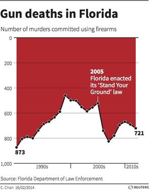
Note. Follow the link to read a subsequent correction to the article, which noted that: "[Business Insider] reader P.A. Fedewa created an easier-to-read version of the above chart from Reuters. It more clearly shows that gun deaths increased between 2005 and 2007 by flipping the y-axis. We're adding it to this post with his permission. The original chart and graphic design was done by Reuters."
Submitted by Priscilla Bremser, who originally found it at the Heap Data Blog here.
From testimony by Michael Gove, British Secretary of State for Education, before their Education Committee:
"Q98 Chair: [I]f 'good' requires pupil performance to exceed the national average, and if all schools must be good, how is this mathematically possible?
"Michael Gove: By getting better all the time.
"Q99 Chair: So it is possible, is it?
"Michael Gove: It is possible to get better all the time.
"Q100 Chair: Were you better at literacy than numeracy, Secretary of State?
"Michael Gove: I cannot remember."
Submitted by Margaret Cibes
"So, all you've gotta do is set up a null hypothesis and try and prove it.
And when you can't prove it, well that means your original hypothesis must be true. …. You said you believe Cassius returns to the scene of the crimes. And you've got photos of every murder. So set up a hypothesis of, say, Stephen Hawking is Cassius... which gives you a null hypothesis of Stephen Hawking is not Cassius. So, go through the photos and try and prove the null... that Rolling Thunder is not Cassius. If you can, that means your hypothesis is incorrect. If you can't... then depending on your 'P' value of course... you've statistically proven your hypothesis must be true. Or that Stephen Hawking is Cassius. Yeah. Some of us didn't sleep our way through Logic and Stats at Harvard."
Submitted by Margaret Cibes
Renal denervation
Setback for high blood pressure treatment
by Denise Grady, New York Times, 29 March 2014
According to the article, "In the United States, 67 million people have high blood pressure, and it resists treatment [by drugs] in about 10 percent of them."
Thus, the interest in
The treatment, called renal denervation, [which] involves threading a tube through blood vessels into the renal arteries, [and] then zapping them with radio-frequency energy to kill nerve endings.
The procedure was thought to be a lifesaver for people whose high blood pressure could not be lowered even with multiple drugs. Uncontrolled hypertension increases the risk of strokes, heart attacks and other problems.
Previous “case reports and studies had found astounding drops in blood pressure after the [renal denervation] treatment — as much as 30 millimeters of mercury in systolic pressure, the top number in a blood pressure reading.” Therefore, to the surprise of many, renal denervation failed in a large, rigorous study.
Unlike earlier, unblinded studies, this so-called SYMPLICITY HTN-3 study was
a prospective, single-blind, randomized, sham-controlled trial. Patients with severe resistant hypertension were randomly assigned in a 2:1 ratio to undergo renal denervation or a sham procedure.
The primary efficacy end point was the change in office systolic blood pressure at 6 months; a secondary efficacy end point was the change in mean 24-hour ambulatory systolic blood pressure.
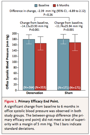
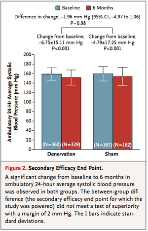
From the figures below, it can be seen that the treatment (renal denervation) and the control (sham treatment) are virtually identical for the primary and secondary efficacy, respectively. That is, for primary efficacy, the treatment failed to beat the control by at least 5 mm HG and for secondary efficacy, the treatment failed to beat the control by at least 2 mm Hg.
Discussion
1. Franz H. Messerli wrote an editorial in the NEJM entitled “Renal Denervation for Resistant Hypertension?” in which he questioned the enthusiasm for the procedure. It has not been approved in the United States but according to Grady,”it has been approved in more than 80 countries and performed on thousands of patients.” She quotes Messerli as saying
You have to perhaps congratulate the Food and Drug Administration that they were not as eager to approve this procedure based on the little evidence there was, as opposed to the Europeans and the Australians.
It [SYMPLICITY HTN-3] is absolutely a landmark study. I hope it will have an impact and will override some of the zeal of the European investigators.
2. As indicated above, the (15) authors of the study regard “clinical (i.e., practical) significance” to be a primary superiority of at least 5 mm Hg or a secondary superiority of at least 2 mm Hg of the treatment over the control. Neither was achieved but with the help of any convenient statistics software, use the numbers in Figure 1 and Figure 2 to show that “statistical” significance was also not achieved in either case for the respective differences between treatment and control.
3. The study also looked at subgroups such as race, gender, age, etc.
Although the differences between groups in some subgroups were nominally significant, the absolute magnitude of the differences was small (<10 mm Hg), and the differences were not significant with the use of a superiority margin of 5 mm Hg or after adjustment for multiple comparisons.
Which “significances” are being discussed here?
4. Point out the similarities of a sham treatment to the use of a placebo when testing drugs. Point out the differences between a sham treatment and a placebo.
Submitted by Paul Alper
Statistics goes to the movies
While the 2012 book Math Goes to the Movies focuses on mathematics, there are several recent articles on statistics in the movies, all written by Michael A. Lewis (Hunter College School of Social Work).
"The search for 'Divergents' and measurement error", Significance, April 7, 2014
"The Silver Linings Chi-Square Playbook", Significance, February 12, 2013
"Probability and Game Theory in The Hunger Games", Wired Social Blogs/Social Dimension, April 10, 2012
"Mathematics and The Hunger Games", Journal of Humanistic Mathematics, July 2012
Submitted by Margaret Cibes
Colicky babies and probiotics
Baby colic (also known as infantile colic) is defined as episodes of crying for more than three hours a day for more than three days a week for three weeks in an otherwise healthy child between the ages of two weeks and four months.
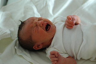
Colicky babies have been around ever since the human race emerged. Probiotics, a linguistic hybrid, almost as long:
The term probiotic is currently used to name ingested microorganisms associated with beneficial effects to humans and animals. Introduction of the concept is generally attributed to Nobel Prize recipient Eli Metchnikoff, who in 1907 suggested that "the dependence of the intestinal microbes on the food makes it possible to adopt measures to modify the flora in our bodies and to replace the harmful microbes by useful microbes."
But do the "live micro-organisms which, when administered in adequate amounts, confer a health benefit on the host"? Many current-day consumers of various versions of fermented milk products certainly believe this to be true. As has been pointed out many times, adults may succumb to the placebo effect; but babies do not lie so it is only “natural” to do a randomized control trial to see if probiatics can reduce suffering in colicky babies. Naturally, newborn babies can’t ingest items such as yogurt or kafir. Therefore, the probiotic used for babies is lactobacillus reuteri dsm 17938 administered via a dropper:
Susan Perry observes
Over the years, parents — and pediatricians — have tried all sorts of remedies to quiet colicky infants. Probiotics is among the latest of these. It’s based on the supposition that promoting microbial diversity in the gut will reduce the formation of gas and intestinal inflammation.
For the current study, a team of Australian researchers recruited 167 breastfed and formula-fed infants (all less than 3 months old) with colic. Each baby met the criteria of a commonly used diagnosis of infant colic: An infant who cries or fusses for three hours or more daily, three or more times a week, and for at least three weeks.
About half of the babies were randomized to receive daily supplemental drops of the probiotic L. reuteri for one month; the other half received a placebo. The study was “doubled-blinded” so that neither the parents nor the researchers knew which babies were in which group.The parents were also instructed to keep a daily diary of their baby’s behavior, including such measurements as how long the baby fussed, cried and slept. Other outcomes were also followed and measured, including the mothers’ mental health and the families’ ability to function and have a “quality of life.”
From the Australian study by Sung et al we obtain the following graphs and associated conclusions:

Conclusions: L reuteri DSM 17938 did not benefit a community sample of breastfed infants and formula fed infants with colic. These findings differ from previous smaller trials of selected populations and do not support a general recommendation for the use of probiotics to treat colic in infants.
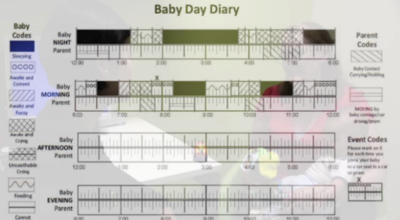
There is a short video of Sung explaining the study. Below is the so-called “Baby Day Diary” taken from the video illustrating how data is recorded.
Discussion
1. What is misleading about the abscissa in the above Fig 2?
2. As is typical in the medical field, unanimity is hard to come by. The above study by Sung for treating babies who already had colic, appeared in April, 2014 in the BMJ. In January, 2014 a paper by Indrio, et al appeared in JAMA which concluded that on the basis of its randomized clinical trial:
Prophylactic use of L reuteri DSM 17938 during the first 3 months of life reduced the onset of functional gastrointestinal disorders and reduced private and public costs for the management of this condition.
The tables below indicate that statistical significance is obtained with respect to preventing colic at one month and at three months. Assume there were 238 in the treatment arm and 230 in the placebo arm; use whatever statistics package is available, and see what p-values you obtain regarding the difference (probiotic minus placebo) in colic minutes per day utilizing the numbers in Table 2 and Table 3.
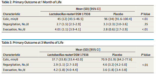
3. In addition to the p-values in Table 2 and Table 3, Table 4 has lots of p-values, most of which are less than the magical .05. If a p-value less than .05 is noteworthy, why is this collection of p-values less impressive?
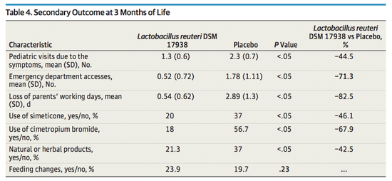
4. Note that if you were to do a search for the probiotic used in both of the studies discussed,“lactobacillus reuteri dsm 17938,” which is made by a Swedish company, BioGaia, you will find many positive hits. On the Wikipedia BioGaia page itself we find this cautionary note: "The neutrality of this article is disputed. Relevant discussion may be found on the talk page. Please do not remove this message until the dispute is resolved. (March, 2013)"
5. There is an accompanying editorial by Bennett to Sung’s article. Bennett says
Infant colic is a challenging problem for many parents, but the cause and effective treatment remain elusive. As its name suggests, colic was thought to arise in the gastrointestinal tract, but after centuries of this supposition we still do not know if this is true. A host of home remedies and drug treatments have circulated over the years, ranging from whisky, to acid suppression, to anticholinergic agents, and onwards to medicine’s most recent “hammer looking for a nail,” probiotics.
He poses the question
“Should we be treating infant colic at all?” A great deal of accumulated clinical experience tells us that children with colic incur no serious long term effects from the disorder, and that symptoms abate with time. The potential harm associated with diagnostic testing and treatment of infants
is likely to surpass the harm from colic itself.
Bennett concludes with sage advice:
As the old adage goes, “babies cry.” Parents and their babies may be better served if we devote more resources to studying the interventions recommended long before the discovery of probiotics: reassurance, family social support, and the tincture of time.
Look up the evocative phrase “the tincture of time” to determine its relevance to colicky babies.
6. A sample of size one is not impressive statistically. Nonetheless, be sure to ask your parents whether or not you were a “fussy” baby. If you weren’t, ask them what they did to prevent colic. If you were, ask them what they did to treat you.
Submitted by Paul Alper
Big data surprises
Big data uncovers some weird correlations
by By Deborah Gage , Wall Street Journal, 23 March 2014
The article is subtitled "There's a Link Between Sales and Phases of the Moon, Among Other Things." It includes the following graphic, which could qualify as a Forsooth!
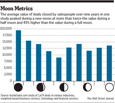
Here is another example:
The online lender ZestFinance Inc. found that people who fill out their loan applications using all capital letters default more often than people who use all lowercase letters, and more often still than people who use uppercase and lowercase letters correctly.
ZestFinance Chief Executive Douglas Merrill says the company looks at tens of thousands of signals when making a loan, and it doesn't consider the capital-letter factor as significant as some other factors—such as income when linked with expenses and the local cost of living.
So while it may take capital letters into consideration when evaluating an application, it hasn't held a loan up because of it.
Submitted by Paul Alper
Paintings by the numbers
Bob Griffin sent a link to:
A statistical analysis of the work of Bob Ross
by Walt Hickey, FiveThirtyEightLife blog, 14 April 2014
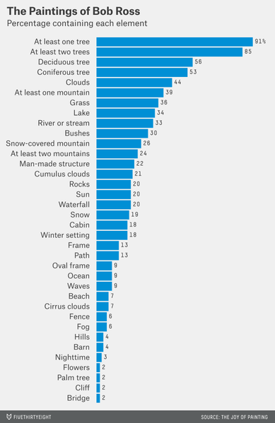
Ross was painter on the PBS series, “The Joy of Painting." He starred in 403 episodes that originally aired from 1983-1994, and are still showing in reruns. The blog post give the following graphic showing how often various elements appeared in Ross's pairings.
The data are available on GitHub. Some analyses performed by FiveThirtyEight readers can be found in the update, Happy Bob Ross visualizations. (21 April 2014).
Variability in employment figures
How not to be misled by the jobs report
by Neil Irwin, New York Times, Upshot blog, 1 May 2014
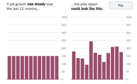
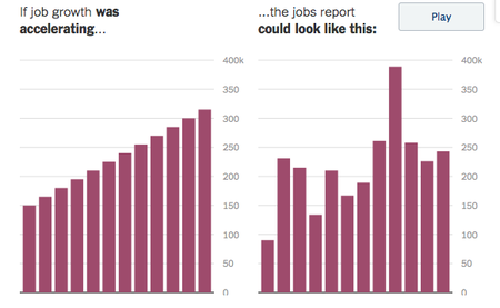
Much attention is paid to the Commerce Departments monthly report of the number of jobs added or lost by the US economy. But only rarely do reports in the popular press highlight the fact that these figures are based on survey data, and hence subject to sampling variability.
Irwin's post here includes an animated simulation (screen captures shown below) that indicates what 12 months of sample data might look like based on various assumptions about what the economy is really doing.
See Is someone cooking the unemployment numbers? in Chance News 88 for discussion surrounding a good jobs report that appeared just prior to the 2012 presidential election. Catherine Rampell wrote in the NYT at that time, "These numbers are always tremendously volatile, but the reasons are statistical, not political."
Submitted by Bill Peterson
A spurious correlation a day!
Spurious correlations
tylervigen.com
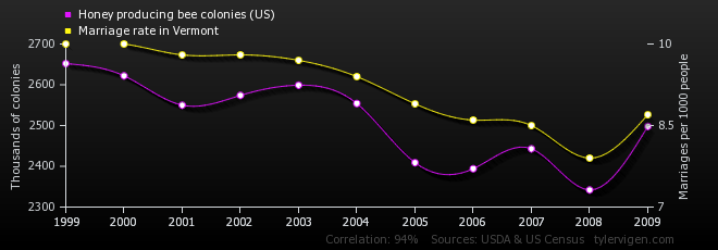
Paul Alper sent a link to this site, which was referenced on the Rachel Maddow show. It is updated daily with a pair of time series plots, with the axis scales adjusted to suggest a correlation. For example, this one [1] on beekeeping and marriage rates in Vermont.
Confusion about odds
When spell-check can’t help
By Philip B. Corbett, "After Deadline" blog, New York Times, 13 May 2014
The After Deadline blog presents stylistic advice for journalists using examples from recent news stories. The present installment includes warnings about vague statements involving odds. Consider these two examples:
- The odds of Mr. Gandhi’s becoming the next prime minister have dropped so low that Mumbai bookies have stopped taking bets on him.
- [Headline] Iraq Unrest Narrows Odds for Maliki to Keep Seat
Corbett writes:
Take care to be clear in referring to “odds.” “Higher” odds could suggest that something is more likely (higher probability) or less likely (1,000 to 1, say, compared with 10 to 1). It was difficult to tell whether “narrows odds” in the second headline meant he had more chance or less. Consider “probability,” “likelihood” or “chance” as alternatives if “odds” might be ambiguous.
On a related note Paul Alper shared the following quotations from What the Numbers Say: A Field Guide to Mastering Our Numerical World by Derrick Niederman and David Boyum (p. 174):
- "If Congress ever decided to act in the public interest, it could do no worse than to pass a law banning the use of odds as a method for stating probabilities."
- "If you're confused [about odds], don't worry, for even if you understand how odds work, you can never be sure if the person you're talking to does."
Submitted by Bill Peterson
Politics and porn (What's the matter with Kansas?)
Distrust your data
by Jacob Harris, opennews.org, 22 May 2014
Harris identifies 6 ways to make mistakes in reporting data:
- Sloppy proxies
- Dichotomizing
- Correlation does not equal causation
- Ecological inference
- Geocoding
- Data naivete
His prime example, which has of these errors, is a story that was widely circulated via social media. It features the following scatterplot
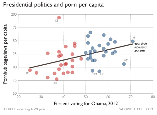
Kansas is a clear outlier. Harris credits a reader of Andrew Sullivan's blog for the following explanation of the geocoding problem:
What happened here was that a large percentage of IP addresses could not be resolved to an address any more specific than “USA.” When that address was geocoded, it returned a point in the centroid of the continental United States, which placed it in the state of—you guessed it—Kansas!
Kansas aside, the red/blue divide still appears striking, until you realize that it simply amounts to drawing a line at 50% ("dichotomizing.") The "ecological fallacy" here--state-wide averages for viewing do not tell us which groups are responsible--is similar to Durkheim's (see Chance News 92 here for more discussion), where he noted that the more Protestant the Prussian province, the larger the suicide rate--but it turns out that the suicides were actually committed by Catholics, not Protestants. The possible analogy here: in Democratic states it may be the Republicans who are frequenting pornography web sites.
On this web site we find a view with the axes reversed
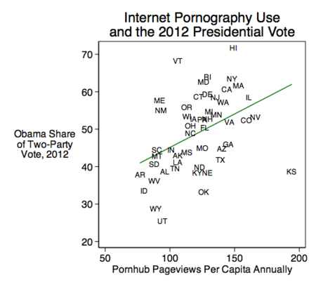
This "reverse causality" has porn viewing "causing" the Obama vote whereas the original has Obama vote "causing" porn viewing. Instead of the loaded term, "causing," this web site tongue-in-cheek says
Porn pageviews explain 16 percent of the variance in state level presidential vote shares. Each per capita pageview is associated with a two-tenths of a percentage point increase in a state's Democratic vote share, and this is statistically significant at the p≤.01 level.
More commentary about all this can be found on Andrew Gelman's blog.
Submitted by Paul Alper
